Machina Máche

Process Blog
Problem Statement
We were originally tasked with tackling the problem of data dignity by creating a product or system that helped users to maintain control of their data. Currently, companies mostly have free reign over peoples data that they easily collect and can predict from our actions on thier platforms. Many people today have surrendered to the fact that companies have data on us and are using it for their own economic gain, with no benefits to us.
We aim to create a product that will allow people to better understand what their data is being used for and where it ends up. Our main goal is to de-stigmatize Big Data and provide ethical avenues for companies/researchers to collect data. Through brainstorming ideas and multiple interviews with potential users, we created Machina Máche.
Project Description
We have designed two platforms for both of our different user bases. A desktop webstite for companies looking for a ethical way to obtain data where they can create requests for data. We also created a mobile app for ordinary people to fulfill requests and potentially get compensated for their efforts. The current design of the application is limited to photos, however this could be expanded to text entry and/or video. Our mobile application and desktop site use material design principles for their design in order to be easily understandable.
Context
This project was created as a part of the User Experience Design course at Seattle University, offered Spring Quarter 2019 through the Computer Science department.
Our group ended up on this idea after reading about an idea similar to ours in a paper called A Blueprint for a Better Digital Society by Jaron Lanier and E. Glen Weyl. We all agreed how companies obtained data from users is in a morally gray area and we wanted to find a better way for comapies to obtain data from users, without bascially stealing it from them. Thus we began creating Machina Máche.
Group Members
- Jack Arnold: arnoldj1@seattleu.edu
- Mitchel Downey: downeym1@seattleu.edu
- Grant Ludwig: ludwigg@seattleu.edu
Design Process
Interview Findings
Before our interviews, our idea for the project was vastly different to our final product. Our original idea was creating an easier way to look at reviews on Amazon. For example, a way to break down reviews of a product on demographics such as: this person has a history of buying headphones and reviewing them.
Interview Round 1
Interviews consisted of 3 males and 1 female, with ages all in their early twenties. All are students at Seattle University. An additional interview was conducted with a fifty year old female from California.
We began our interviews with asking people about what data dignity ment to them, how they feel about companies using and collecting their data, and then reviews for products. Through interviewing, we found that our participants mostly reviewed when angry or overwellmingly happy with a product. We also found that reviews do matter when its a product they are not familar with. When looking at reveiws, they would like to look at review history and past products reviewed/bought by the reviewer but it’s time consuming.
The interview with the older woman demonstrated the gap in understanding of the internet and technology in general between generations. She was mostly okay with companies collecting her data as they wished because she had “nothing to hide”. She did seem receptive to the prospect of being paid for a review. She expressed some disdain for targeted ads.
As our group met with our findings, we relized how difficult it would be to basically redesign Amazon’s review system. After looking at our responses we noticed how all of our participants were unhappy with how companies collected and used their data. One participant said that he was hesitant to trust companies which took in his data to actually use it as they promised to. Through our findings and the ideas from A Blueprint for a Better Digital Society, we created our concept for Machina Máche, name pending at the time.
Interview Round 2
Interviews consisted of 1 male and 1 female, with ages all in their early twenties. All are students at Seattle University and are different people from our first round.
In these interviews, we focused on data collection by companies. Through our interviews, we confirmed our findings on data collection from our last round and gained more insight. Clarity in how data was being used we found to be a large plus from our participants. They also said that if companies compensated people for providing data as well as stated what the data would be used for, they would be more inclined to provide data.
From our second round, we relized our idea for Machina Máche was viable. The main tenents we needed to focus on was clarity on what data was being used for and compensation as an option for companies looking for data.
Design Sketches
Individual Sketches
Using our findings from interviews, each group member created sketches. This was to help create a diverse range of designs and possibly present new ideas to others of the group.
Group Sketches
Once we had some sketches, we came together as a group to go over our individual work and refine the sketches together. This then helped us to figure out our information architecture and think about task flows.
Mobile App Sketches
Desktop Sketches
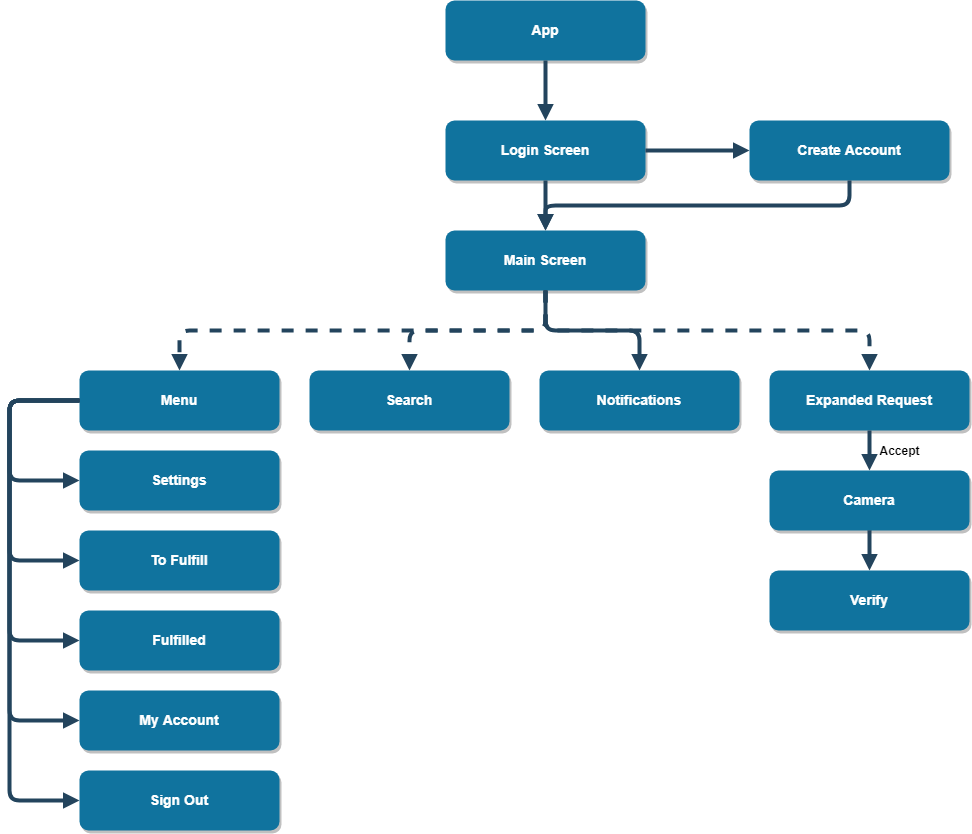
Information Architecture
From our sketches and iterations on them, we were able to determine our mobile app’s information architecture. At this stage we only really had a clear idea of how the flow of our app should be, which is why we created an information architecture only for it. Later through our tasks flows, we gained a better understanding of the desktop site.
User Task Flows
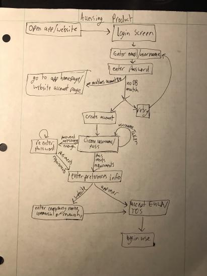
This task flow applies to first time users of both the desktop client and the mobile application. It aided us in determining what extra pages needed to be developed for our product in the next step of development. It also helped us to know what exactly ought to be included on preexisting pages.
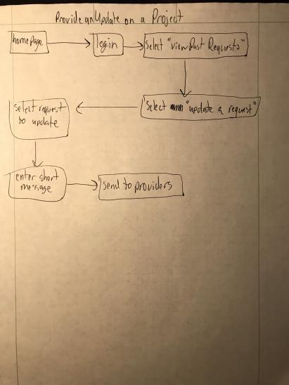
This highly linear task flow is concerned with sending project updates to individual users who provided a business client with photos previously.
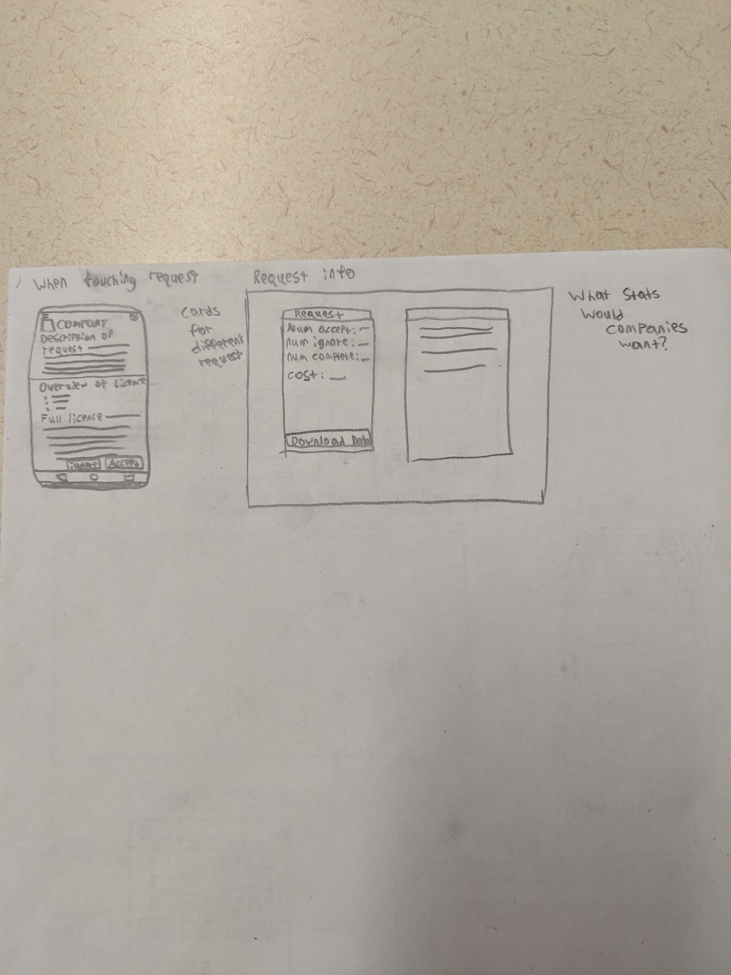
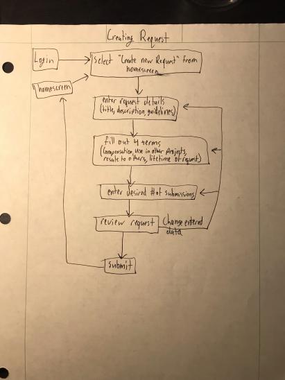
This task flow is concerned with a business client creating a request for data from the mobile app user base. When providing details about a request the order in which they are provided is not important, what is important is that they are all filled out to a satisfactory level before submission.
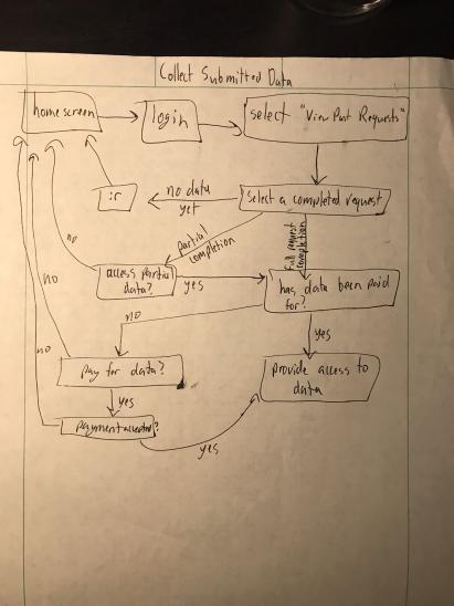
This page is concerned with accessing the photos supplied to a business client via our service. The main sources of confusion at this stage are concerned with data set completeness and whether the data has been payed for. The main hurdle for a business client to overcome in accessing their data, is actually paying for the use of the photos before gaining access.
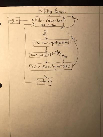
This is the only task flow which is concerned exclusively with the mobile application and its users. It shows the normal flow of a user fulfilling a request.
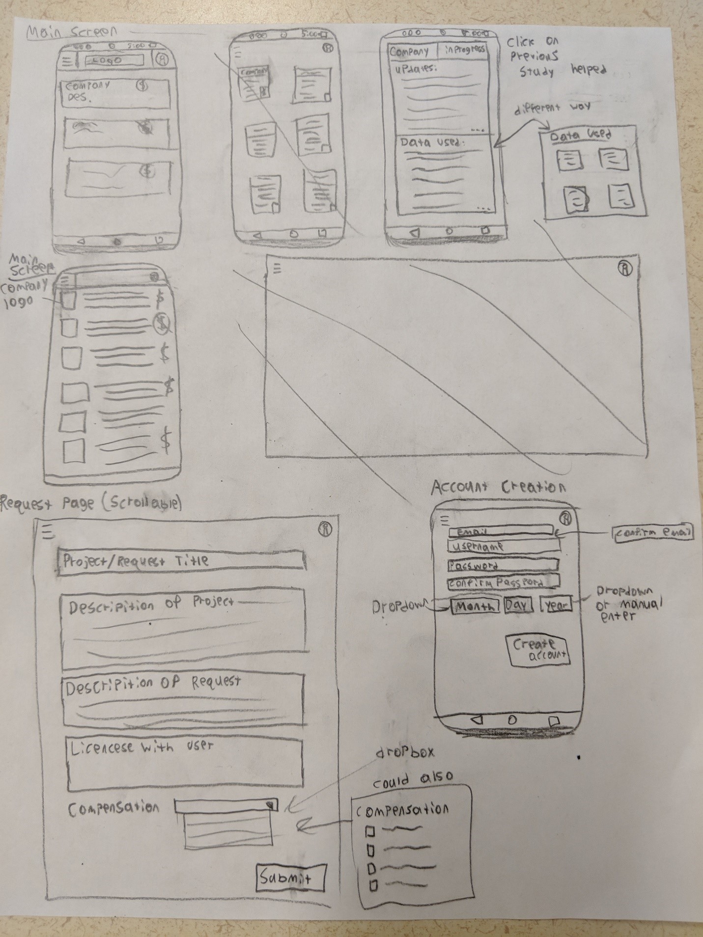
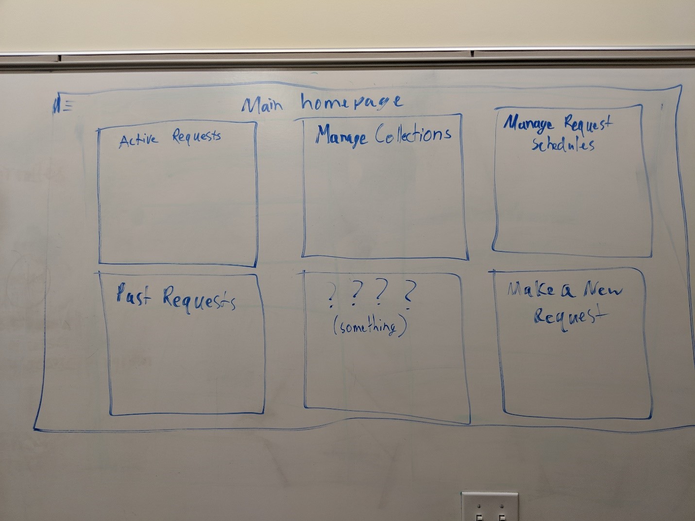
Paper Prototypes
The next step was to create paper prototypes of our design, utilizing our previous sketches and our work ironing out task flows.
Mobile App
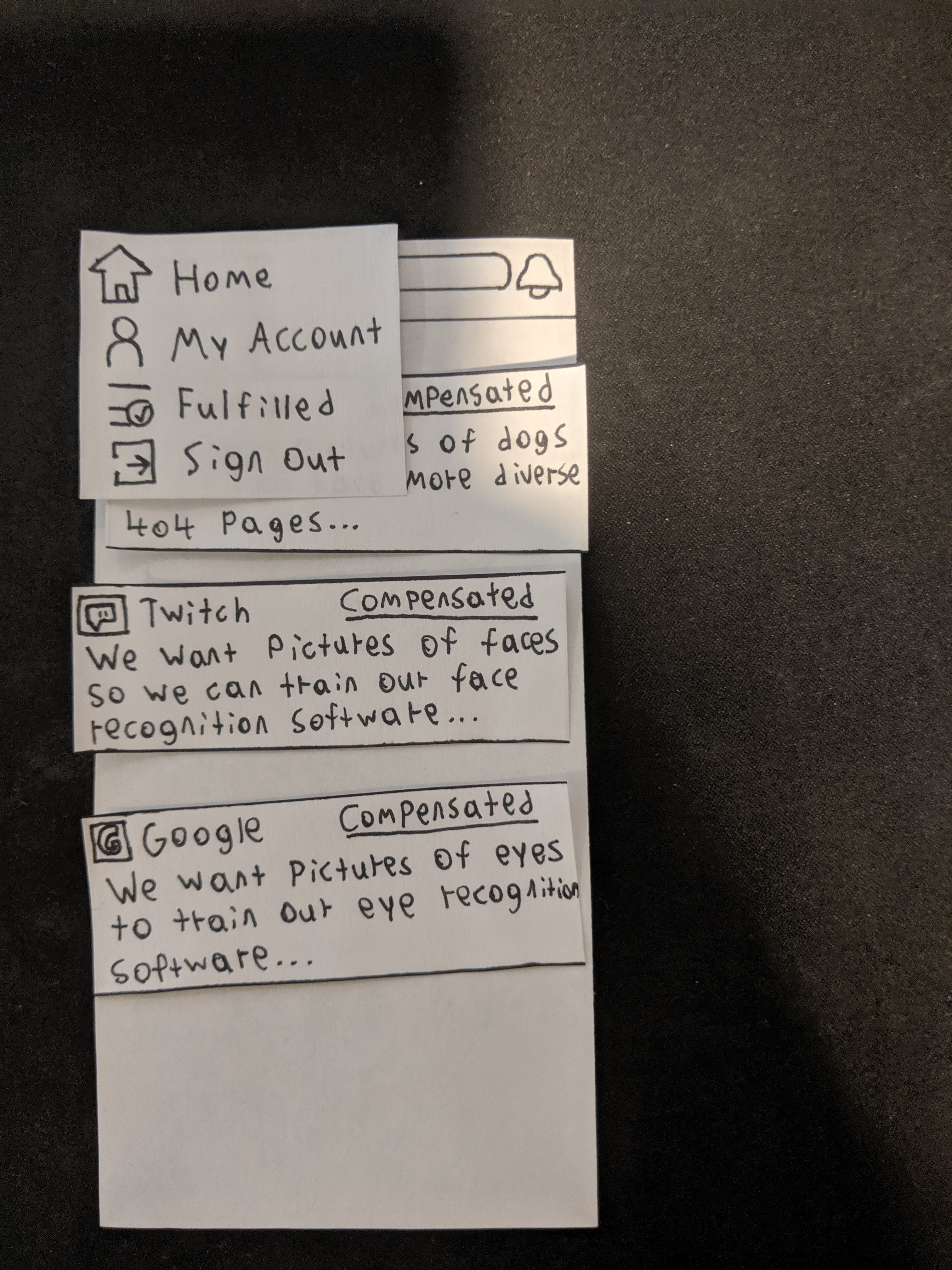
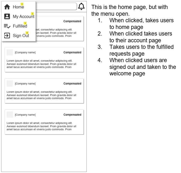
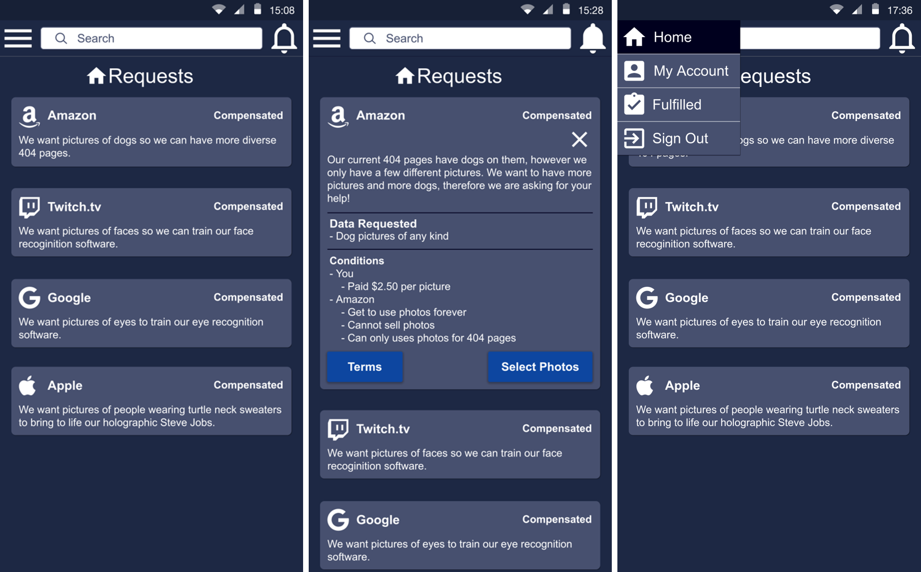
Through creating the paper prototypes we realized that our menu for the app had too much in it that wasn’t really needed. We then redesided the menu to only have Home, My Account, Fulfilled, and Sign Out in it.
Desktop
Findings from User Evaluations
When testing our app prototype on a user we had them attempt to fulfill a request as a brand new user. One major point from users was the lack of confirmation. The two points where this was requested was when they were ready to send photos and once they had sent photos, a confirmation that their upload was successful and photos had been sent. Users were also confused why they had to take pictures first instead of being able to select elgible photos from their camera roll.
Commentary on our desktop site was largely concerned with how cluttered our information appeared on the small paper sheets. We all felt that when viewed on an actual computer screen, the information would be readable and accessible by all, therefore we did not make too many changes based on comments recieved on our webpage.
The vast majority of the commentary was positive and helped us to know we were progressing in the proper direction.
Annotated Wireframes
Mobile App Wireframes
Comments on the app wireframes were overwellmingly positive, however there were a few small critiques. Someone pointed out that each screen should have what it is at the top so the user knows where they are in the application. Someone else also said that the select photos screen was too cluttered. Both suggestions were incorporated into the final mock-up.
Desktop Wireframes

High-fidelity Mock-ups
Interactive mock-ups
Mobile App Mock-up
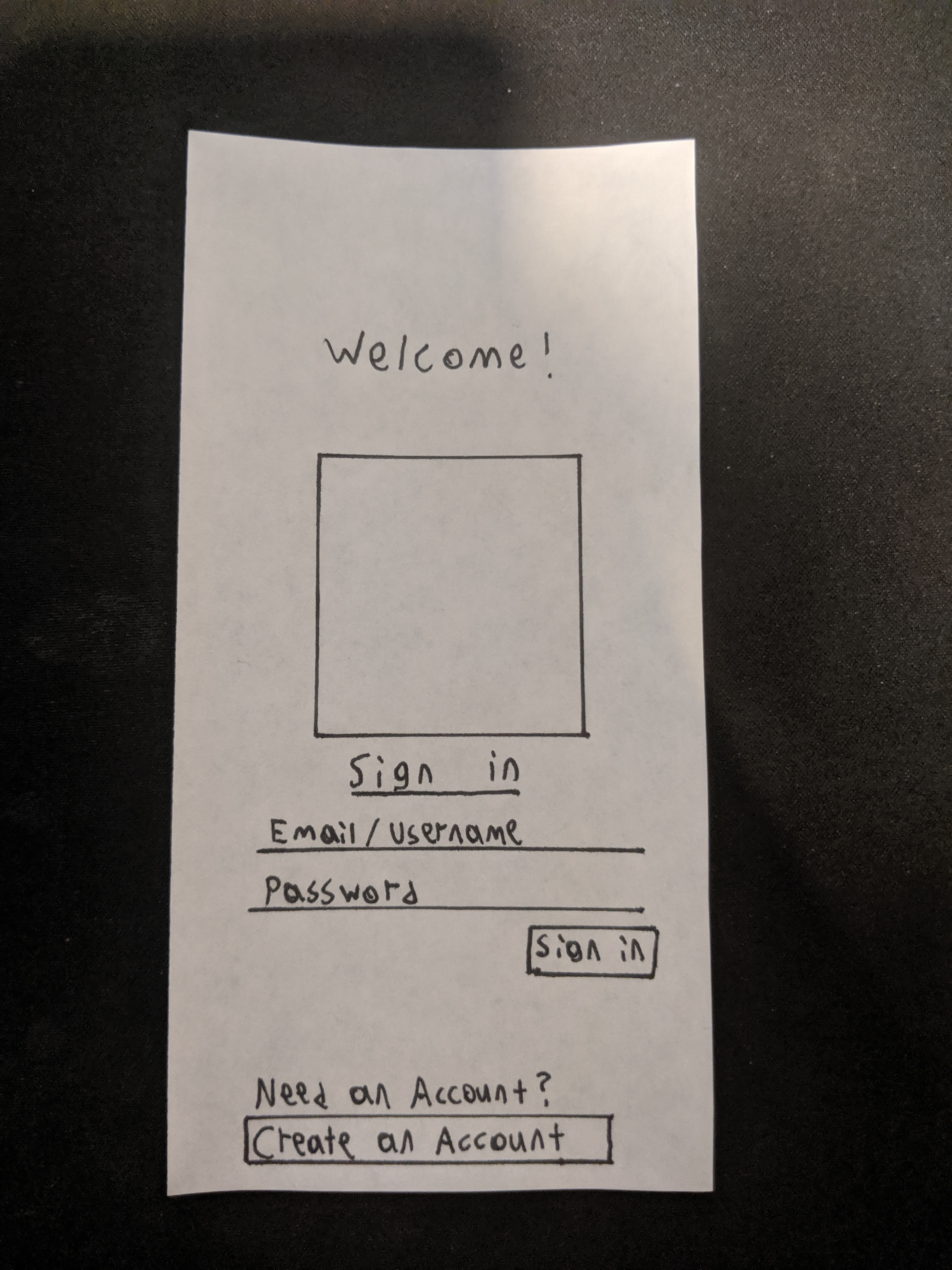
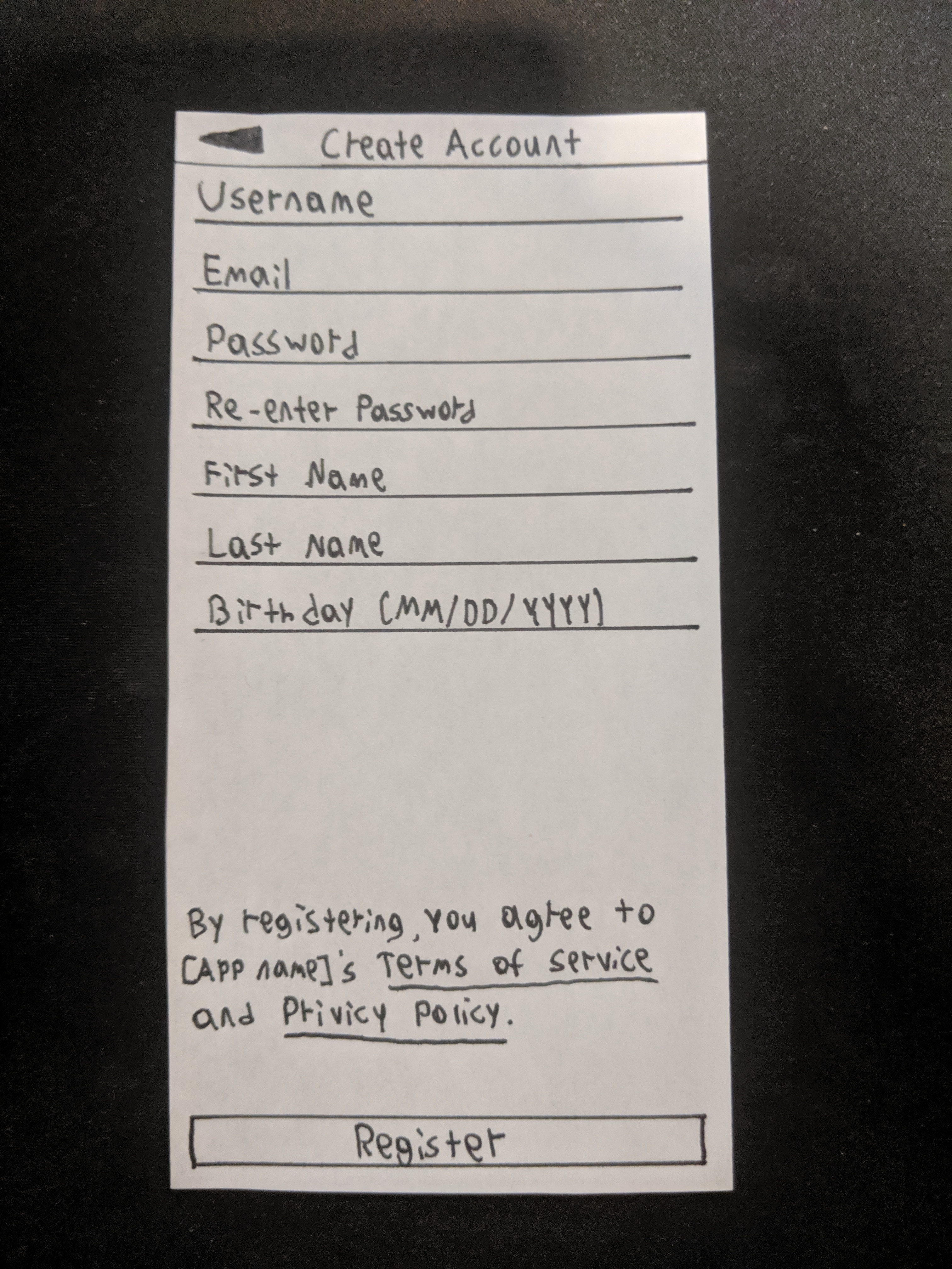
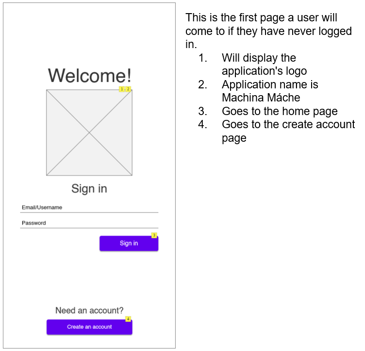
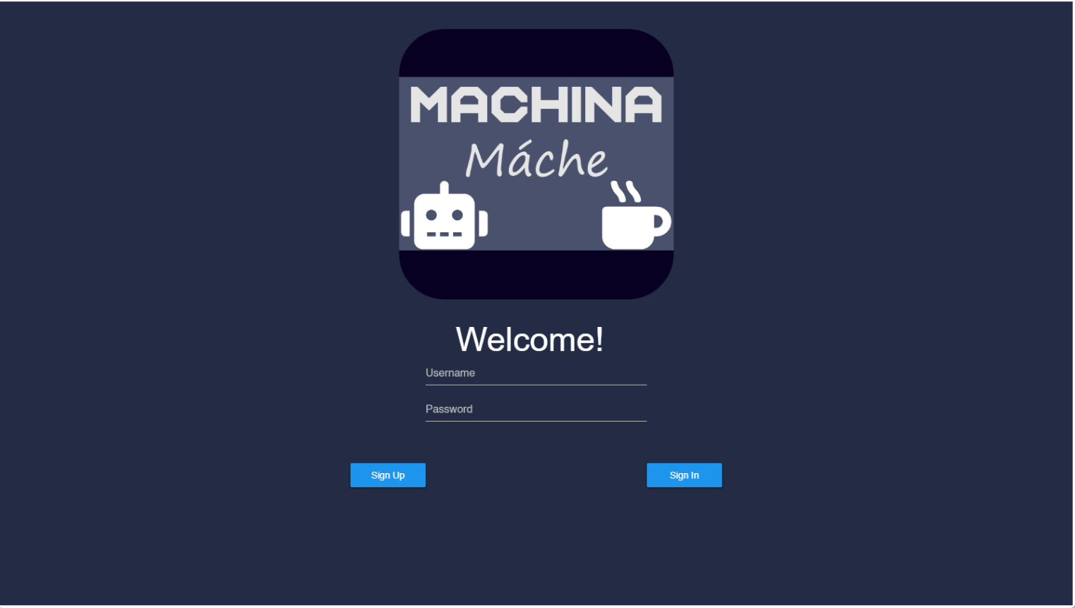
Login and Create Account
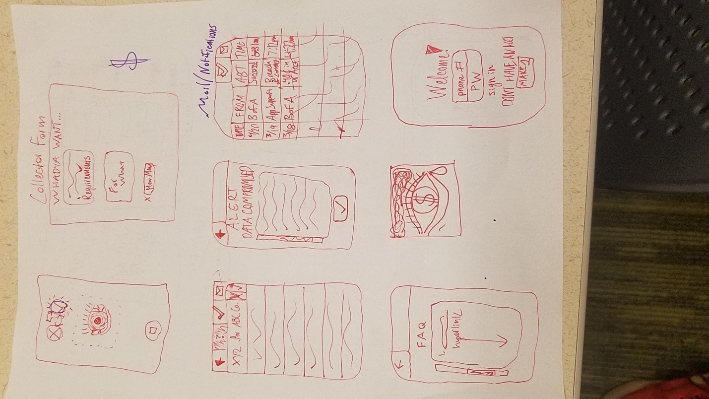
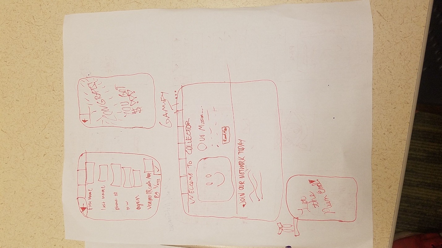
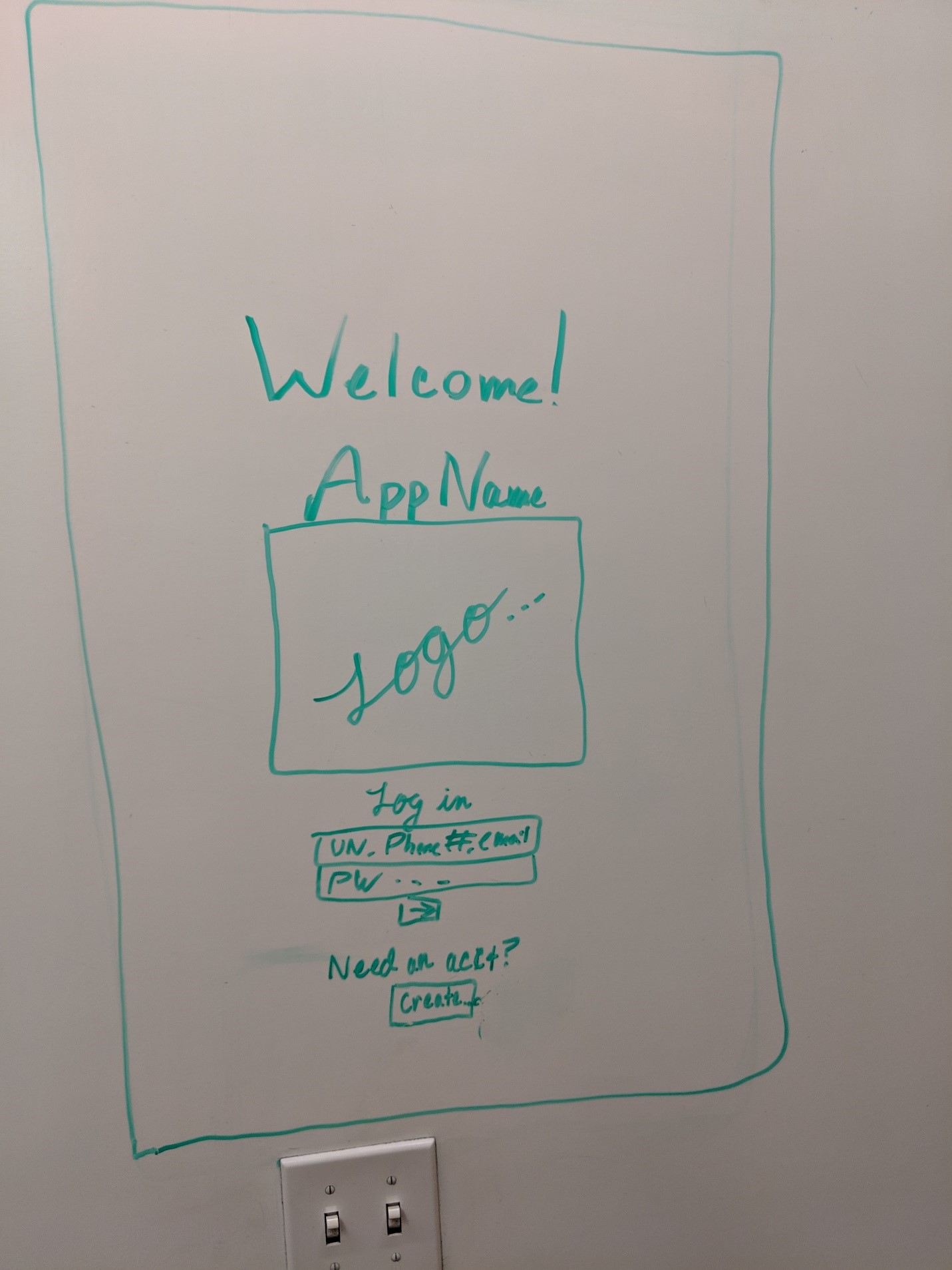
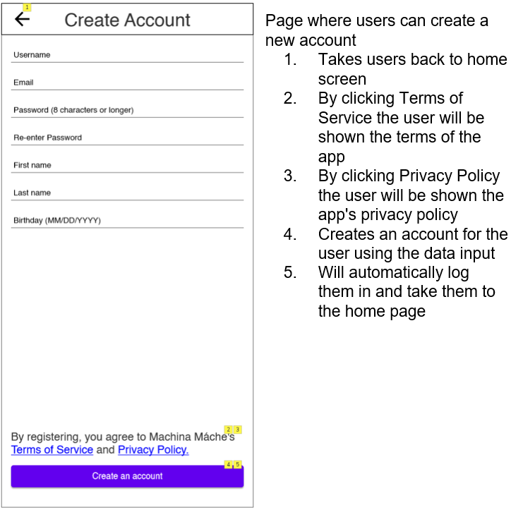
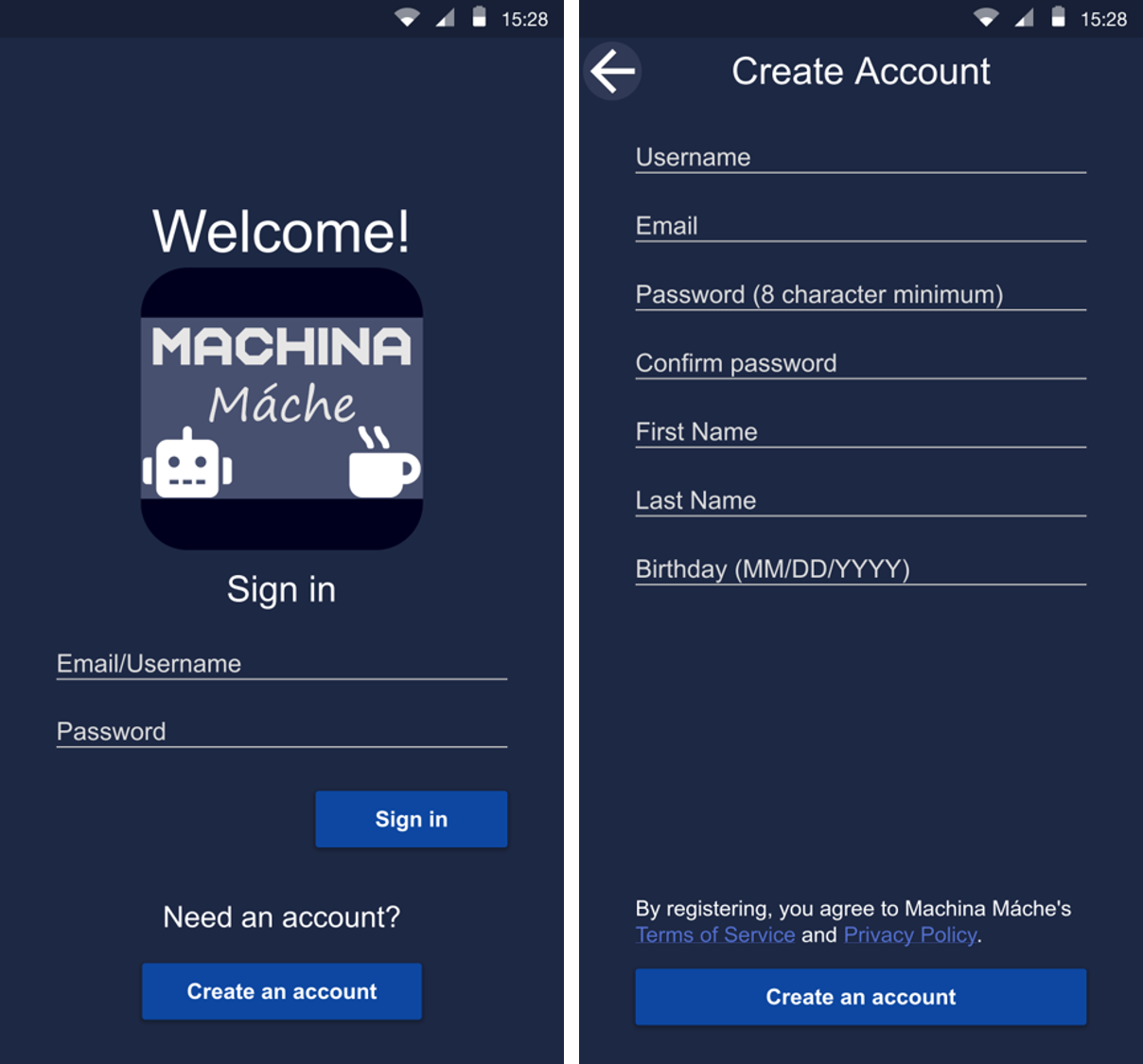
This is the login and create account screens of our application. Here the user can login to their account or if they are a new user, they can create an account. Once they are signed in or have completed sign up they will go to the Home screen.
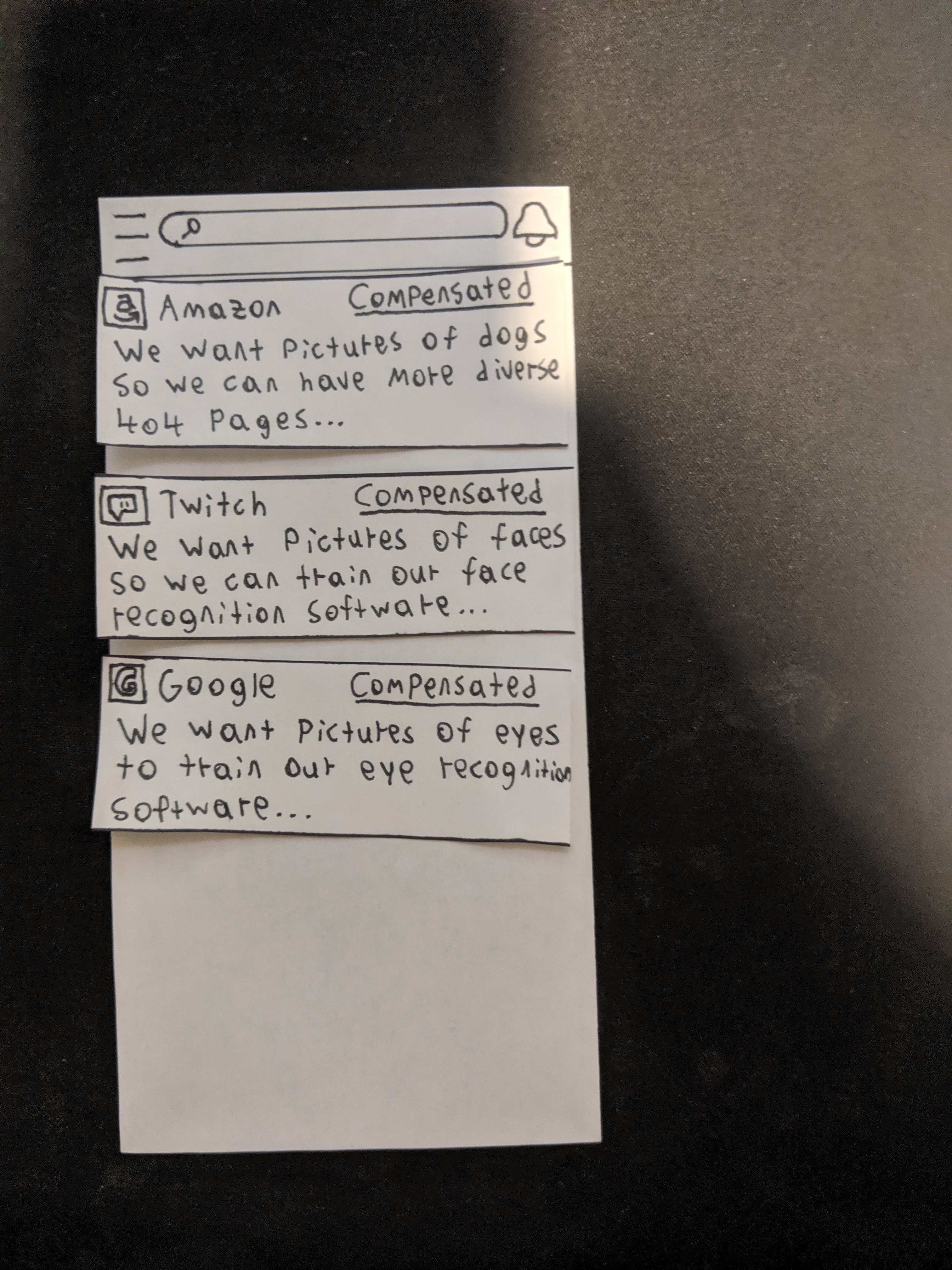
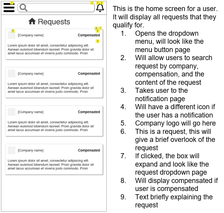
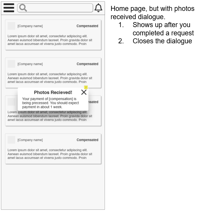
Home
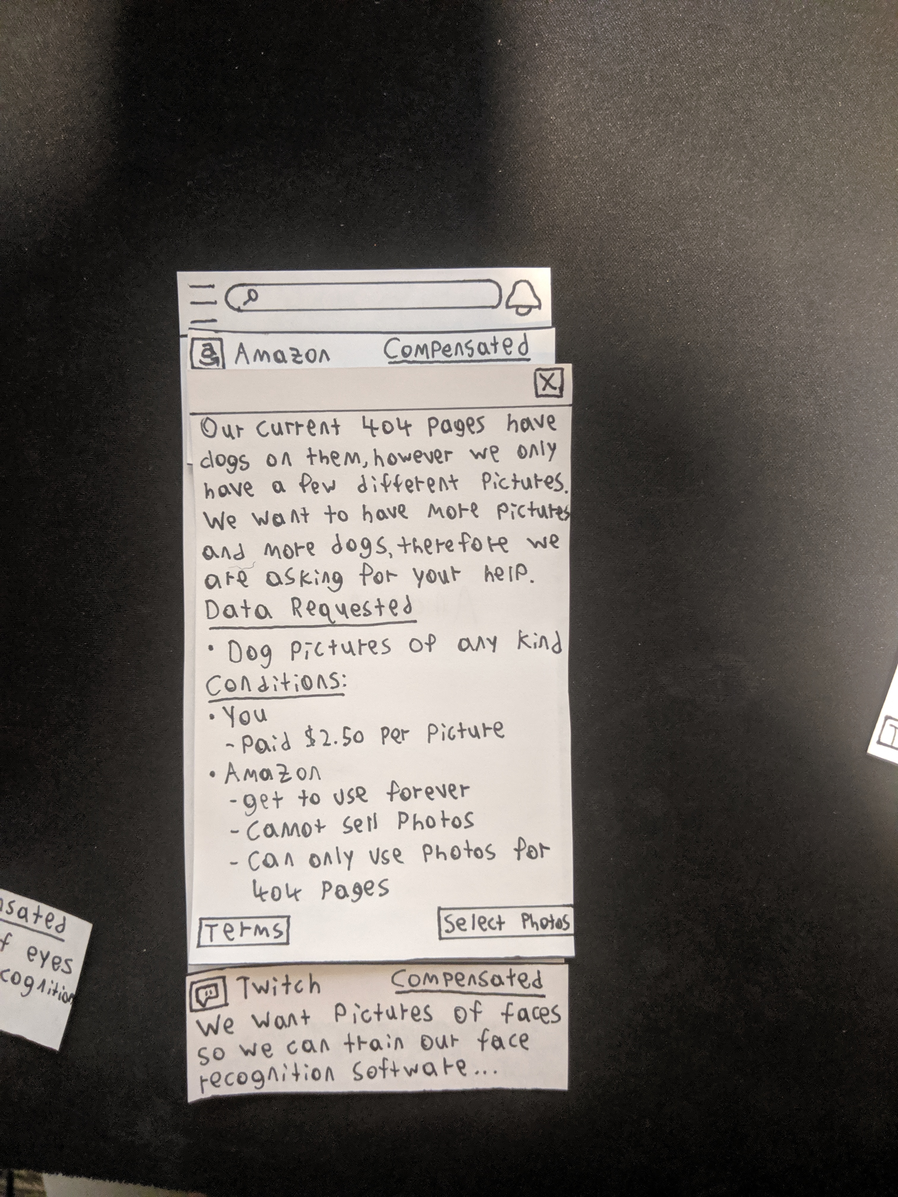
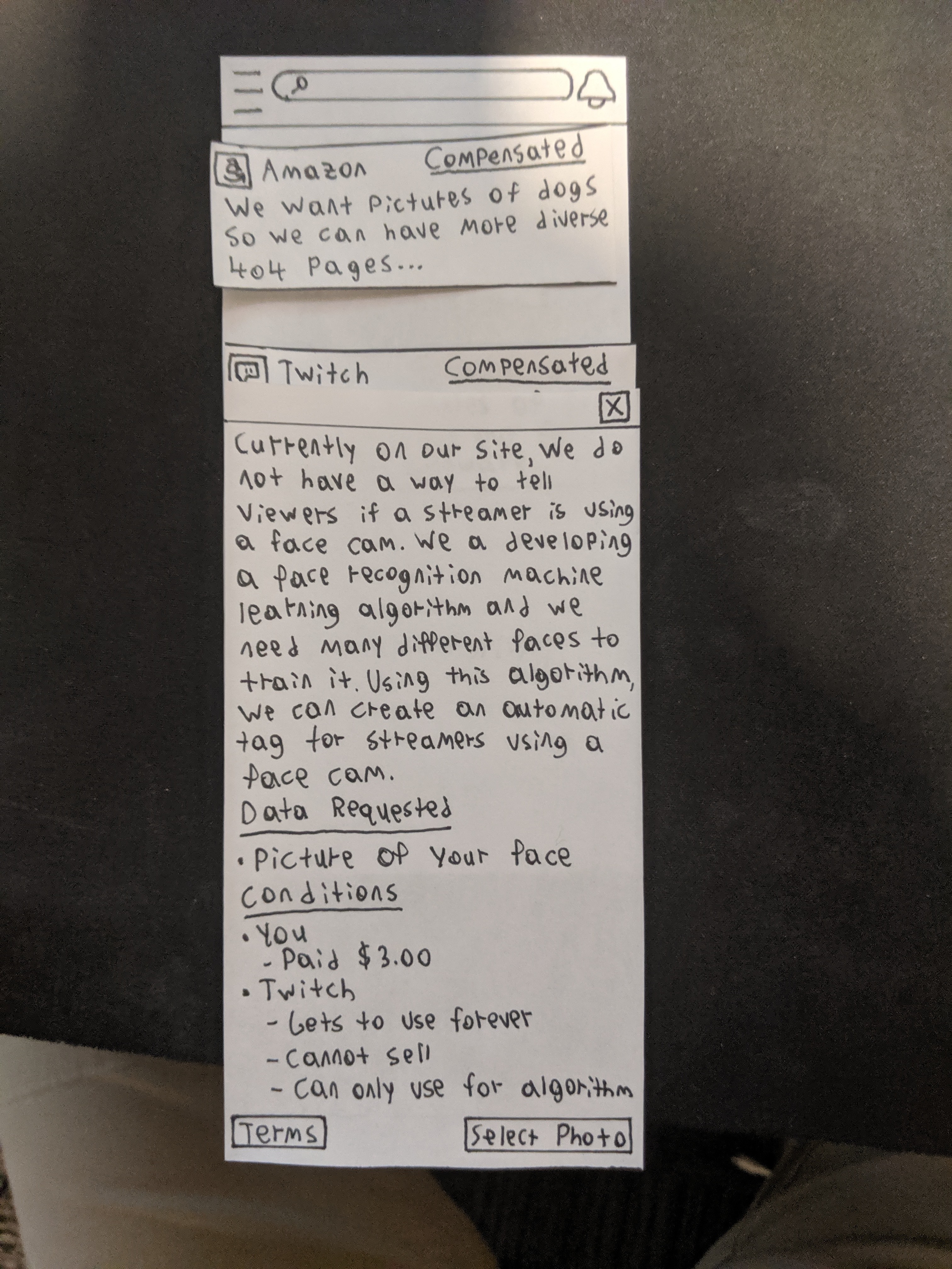
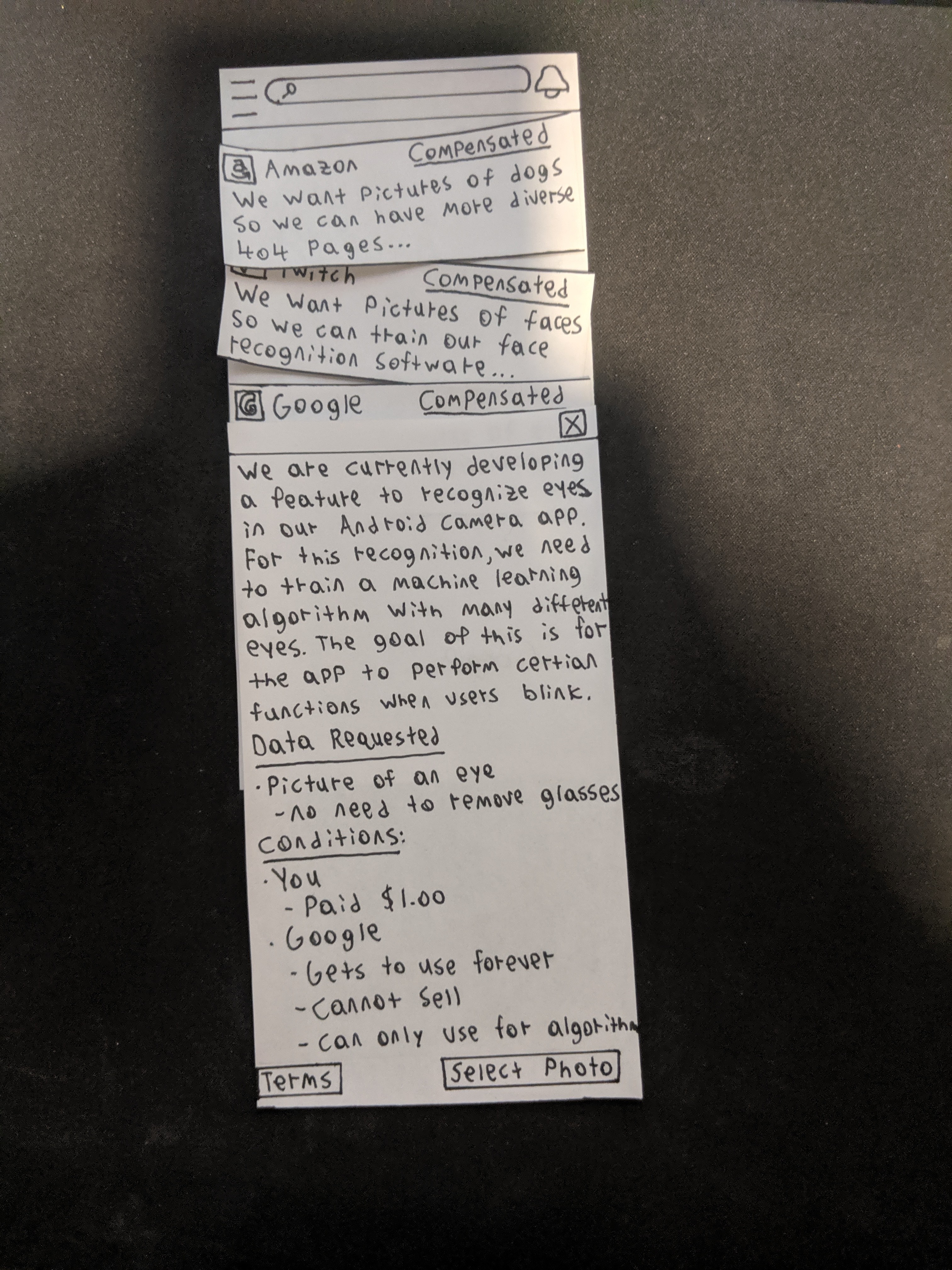
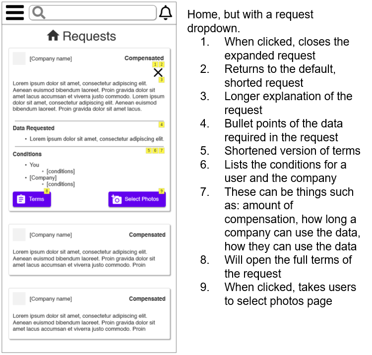
This is the home screen, the main feature of our app. This screen displays all the requests a user qualifies for. From this screen the user can open the menu to go to the my account screen, fulfilled screen, and logout. They can also go to notifications in the top right. If they would like to learn more about a request, they can touch the box with the request and the request expands. Once expanded a user can read the full terms or go to select photos for the request.
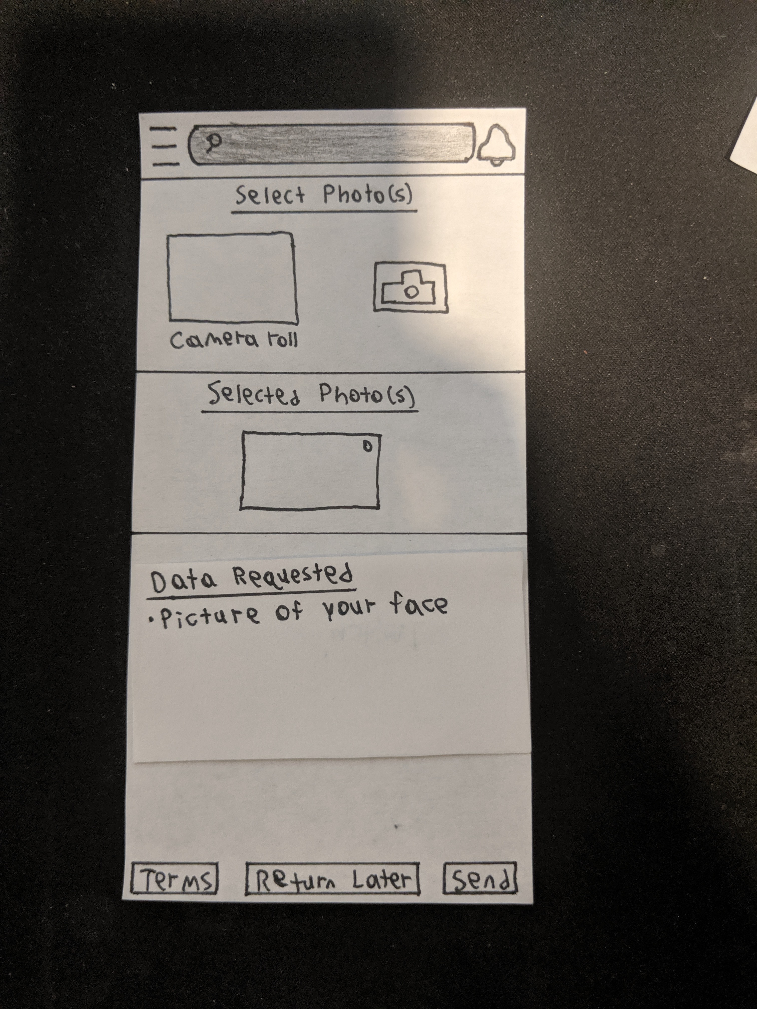
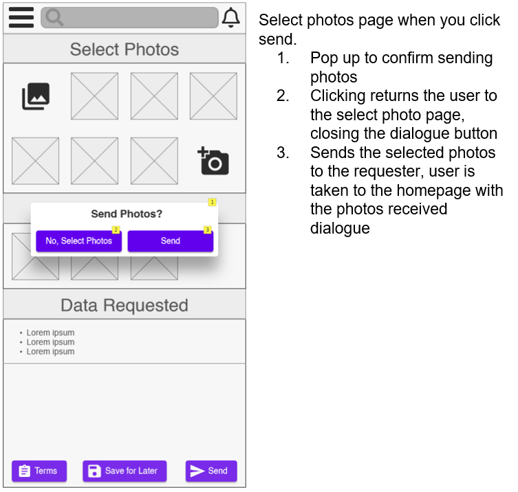
Request Fulfillment
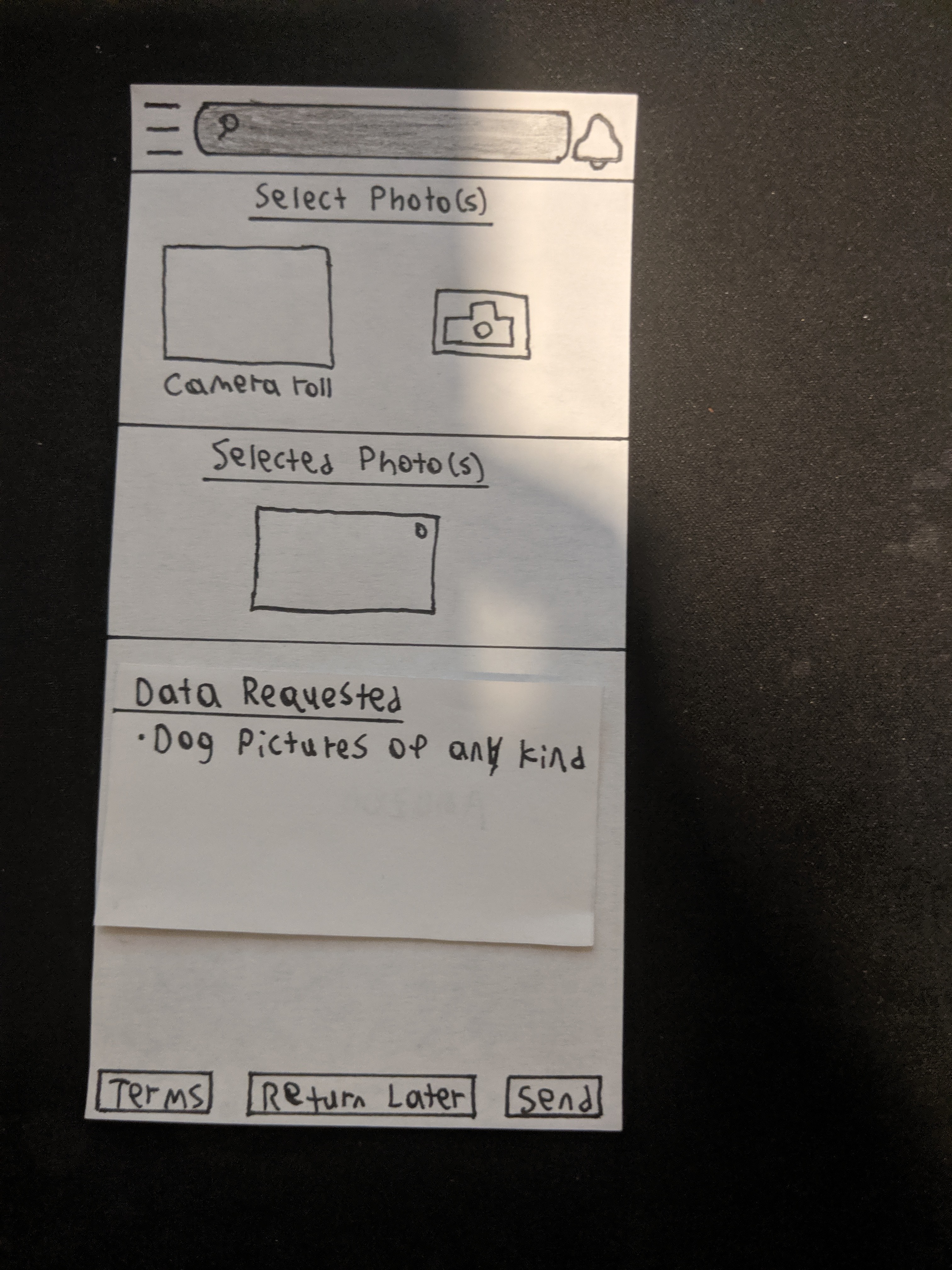
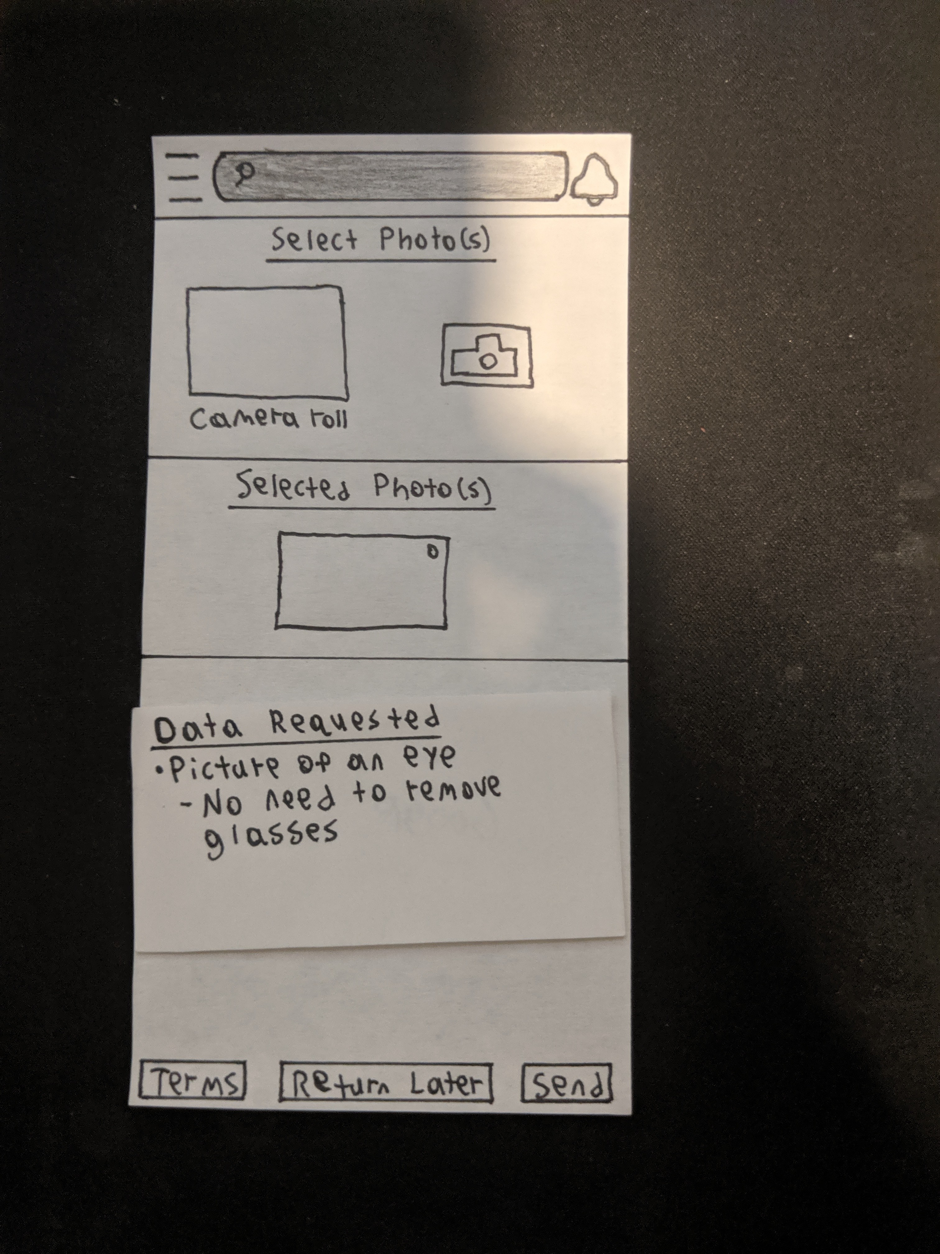
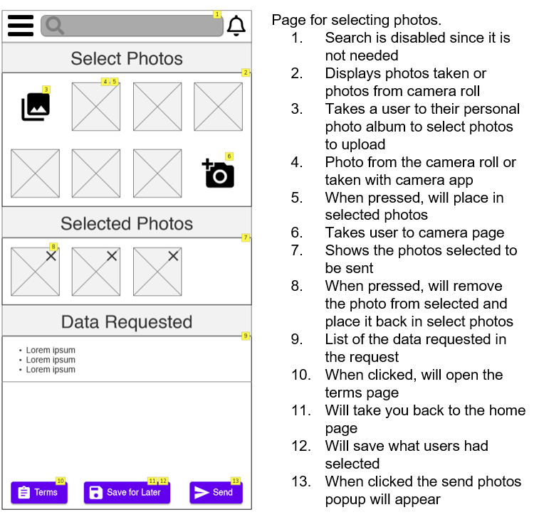
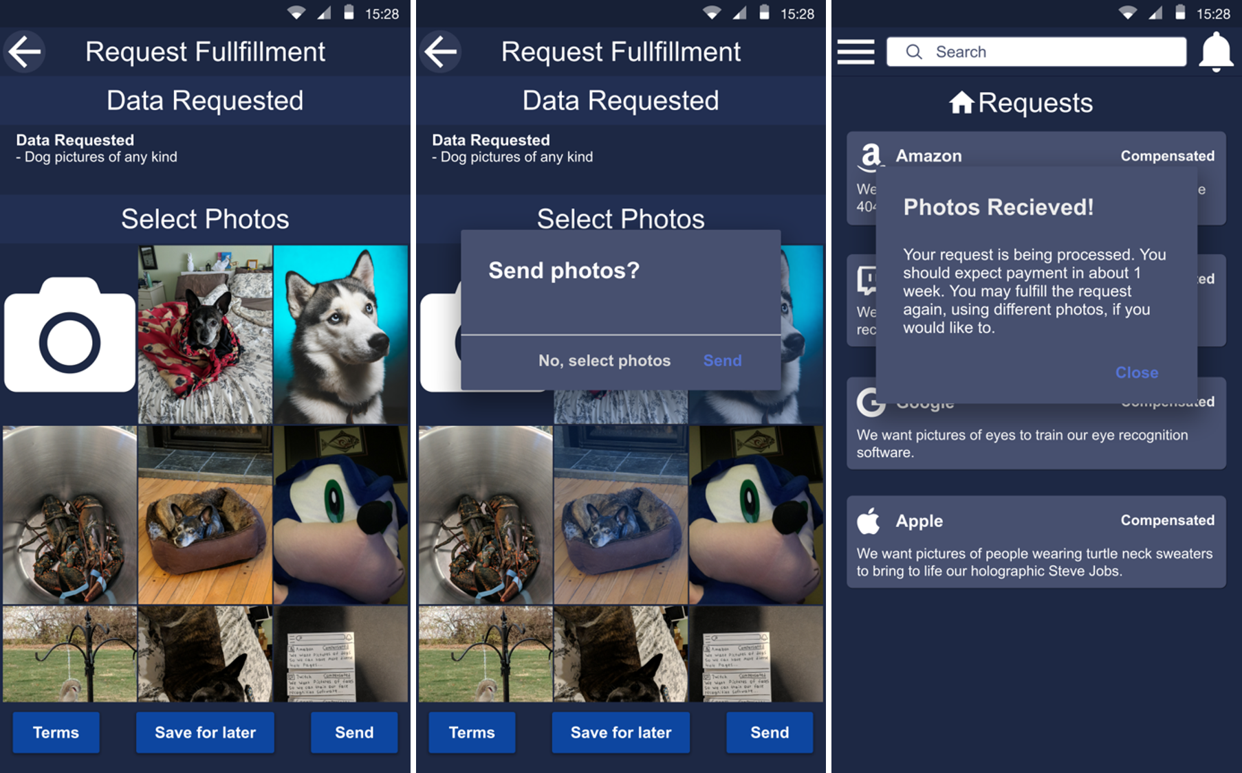
The first screen shows what will show up after choosing to select photos from a request. This displays all the photos in your camera roll (which the app will ask for permissions for) which you can select for the request. This screen has been vastly redone because of feedback. We were told the old version had too much on it and it would be simplier to just fully integrate the camera roll into selection. Off of that feedback, we created this new designed screen. Once a user selects the photos they want to send, they can touch send which will display the below popup. After they confirm sending, the last below popup will display on the home screen.
App Camera
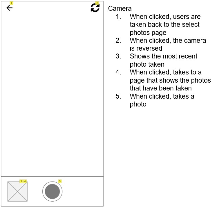
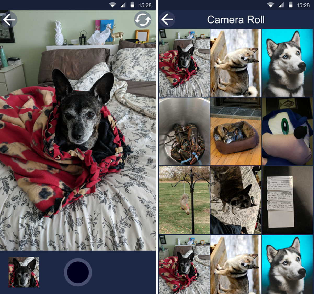
This is the app camera. Here a user can take photos for a request. Also if the company requires, for example, an eye picture in a specific part of the photo, the app will display a box for the user to focus their eye into. The second screen displays the pictures that you have taken with the camera. Once a user leaves the page, the new pictures will display on the camera roll on the request fulfillment screen.
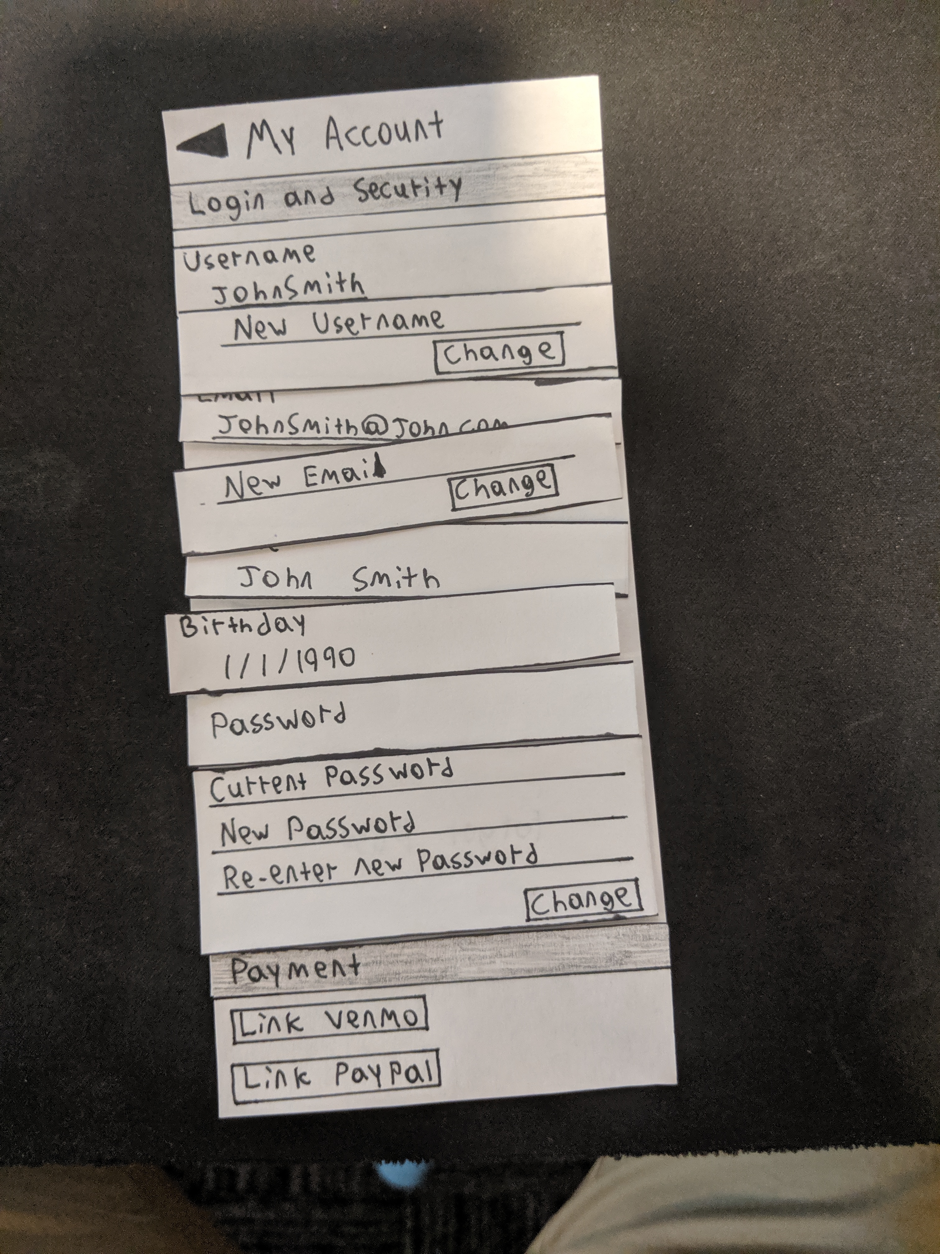
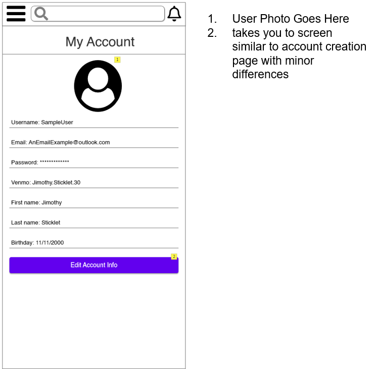
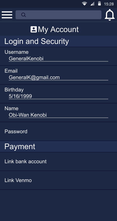
My Account
This screen displays a users information. The user can change thier username, email, and password. From this screen the user can also link their bank information or Venmo (do not know if actually possible) for payment.
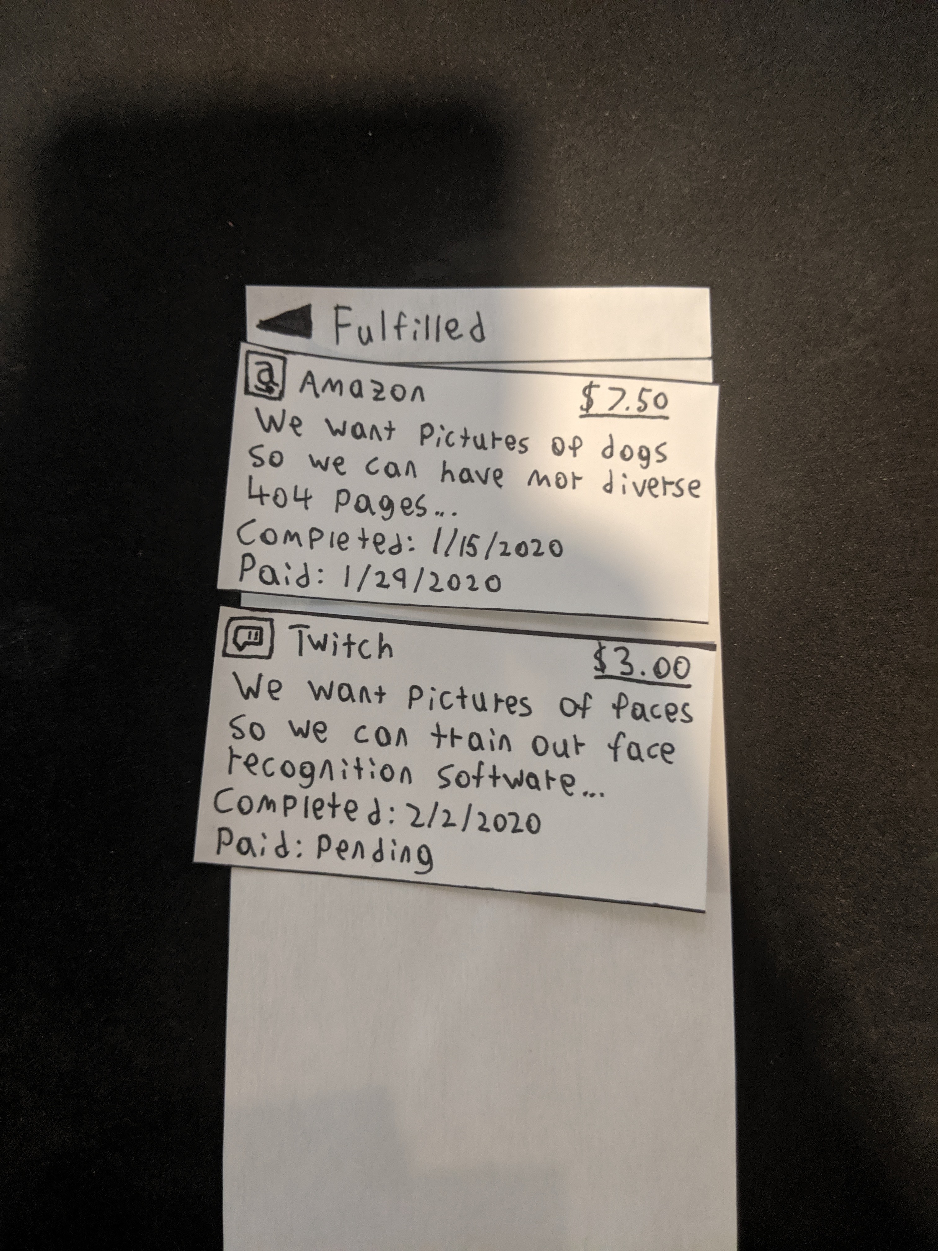
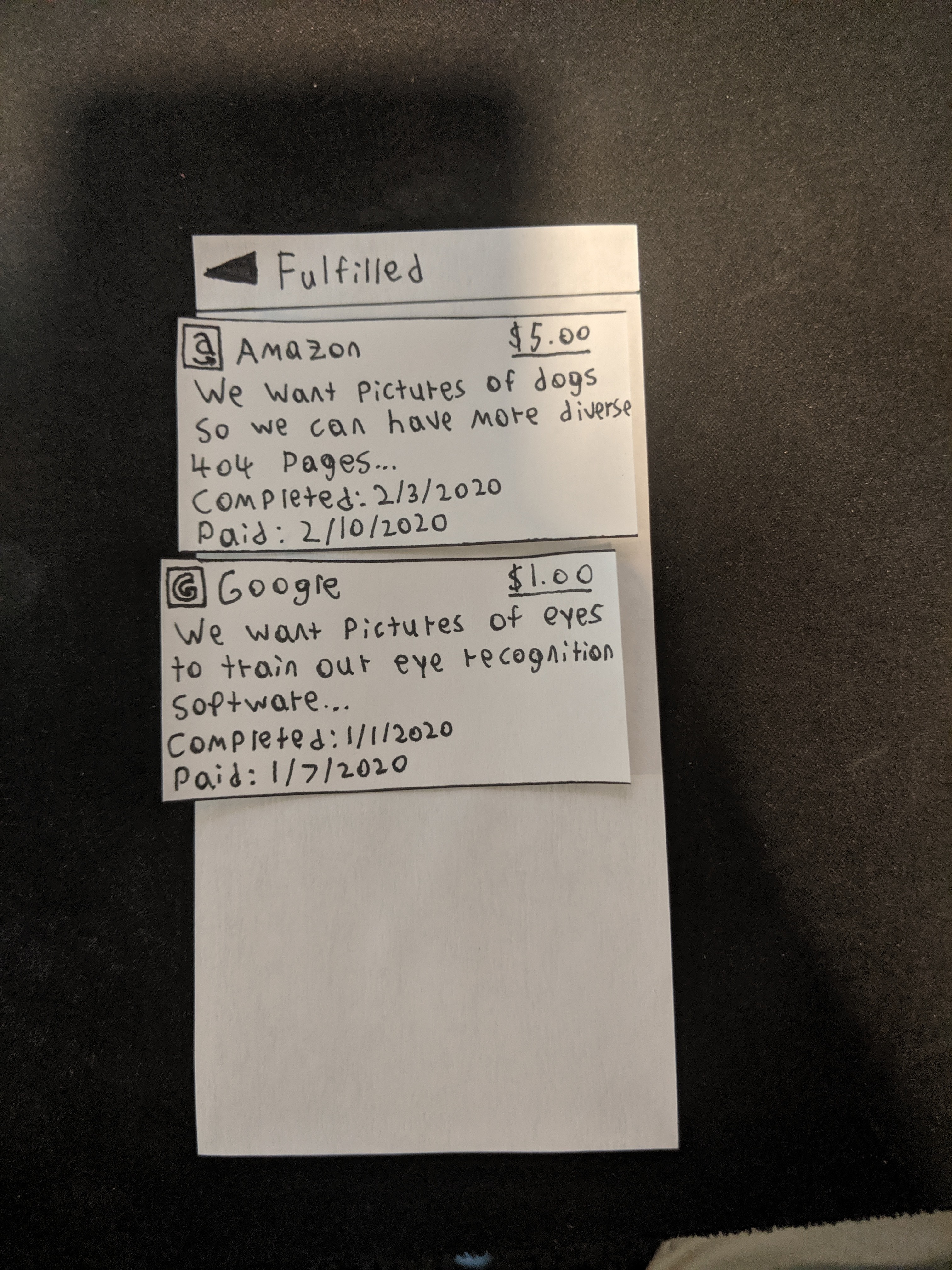
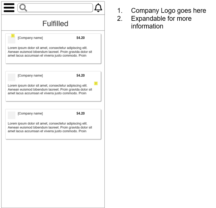
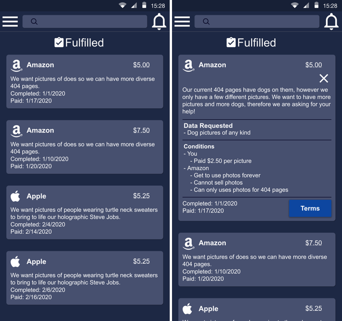
Fulfilled
This screen displays all of a users past requests that they have fulfilled. If touched on, it will expand displaying the information about the request.
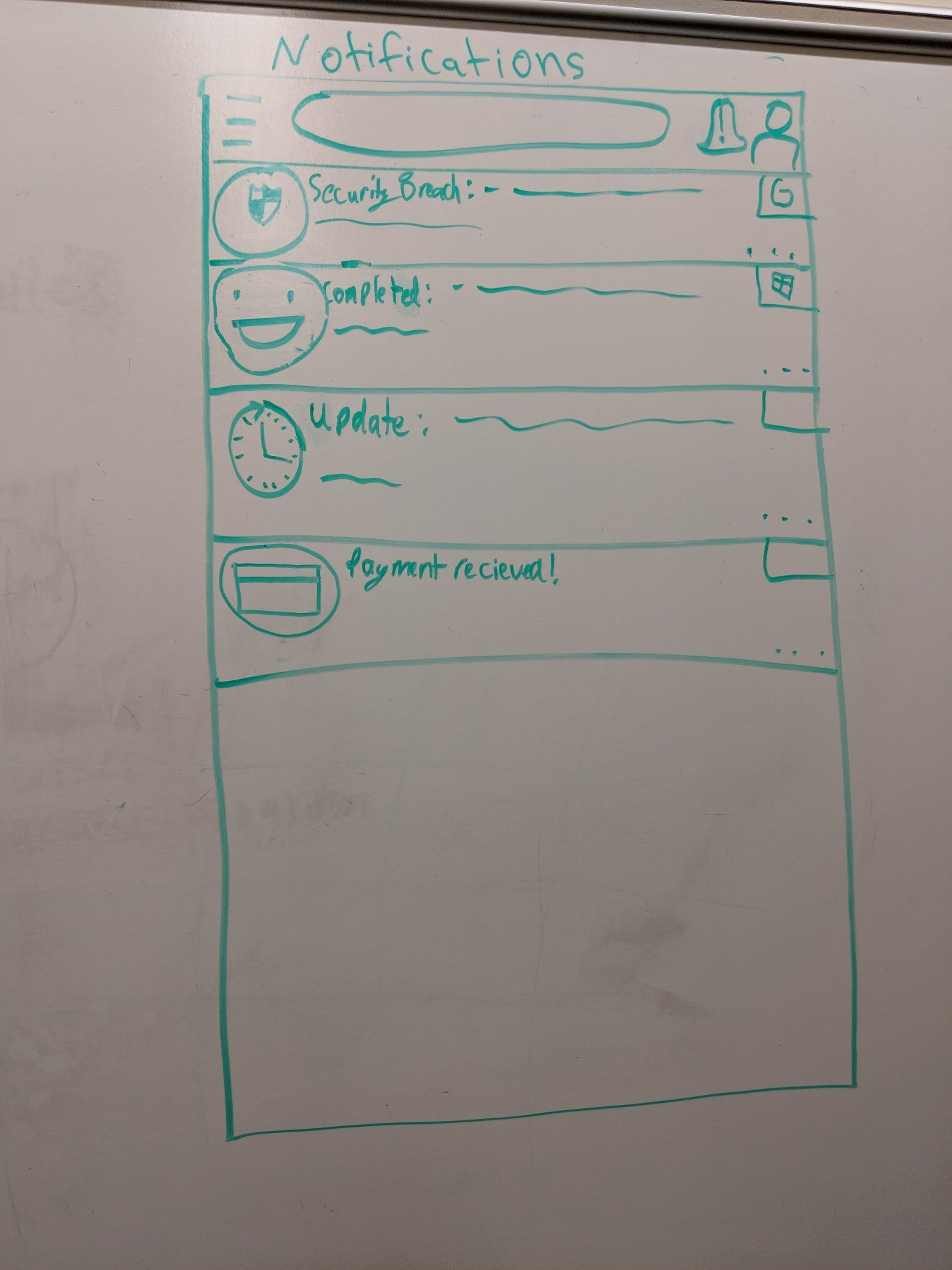
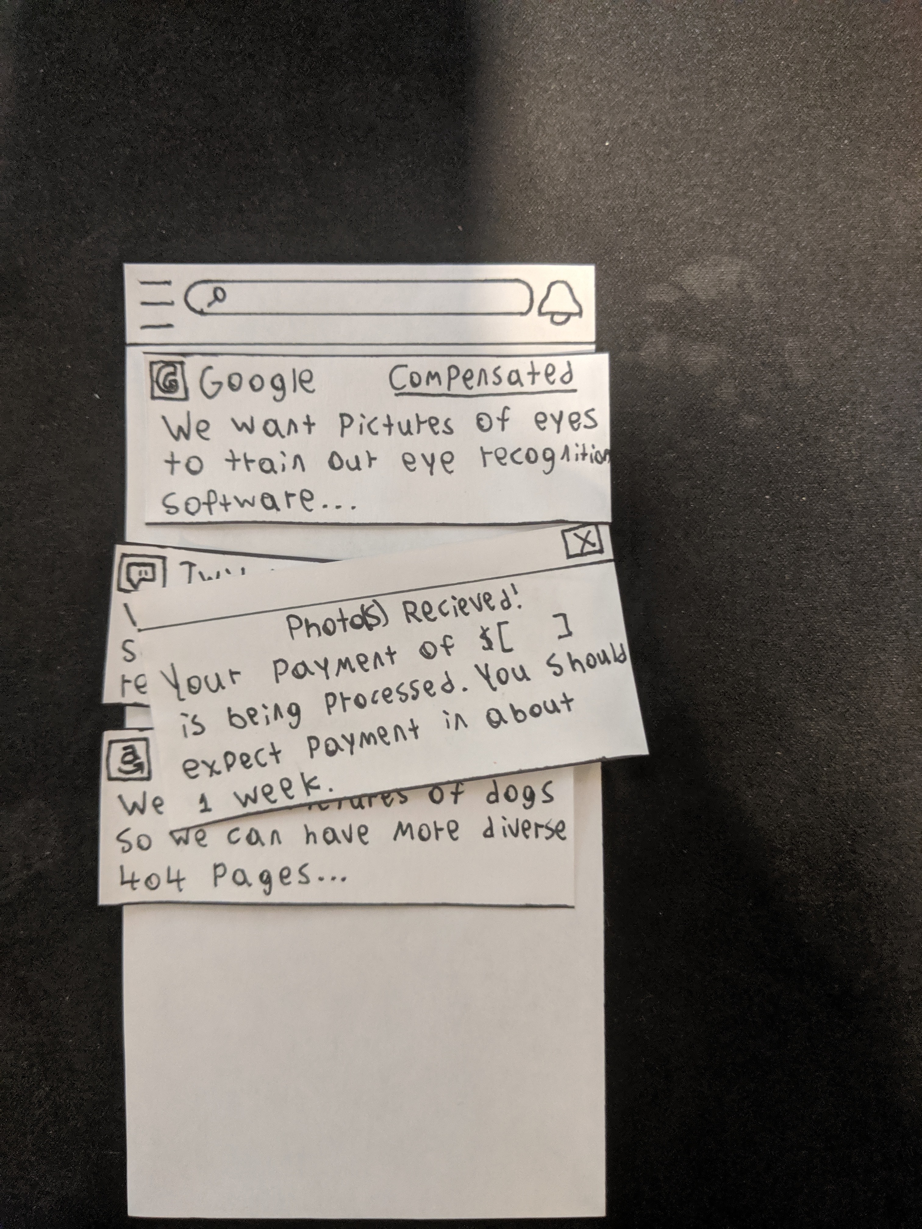
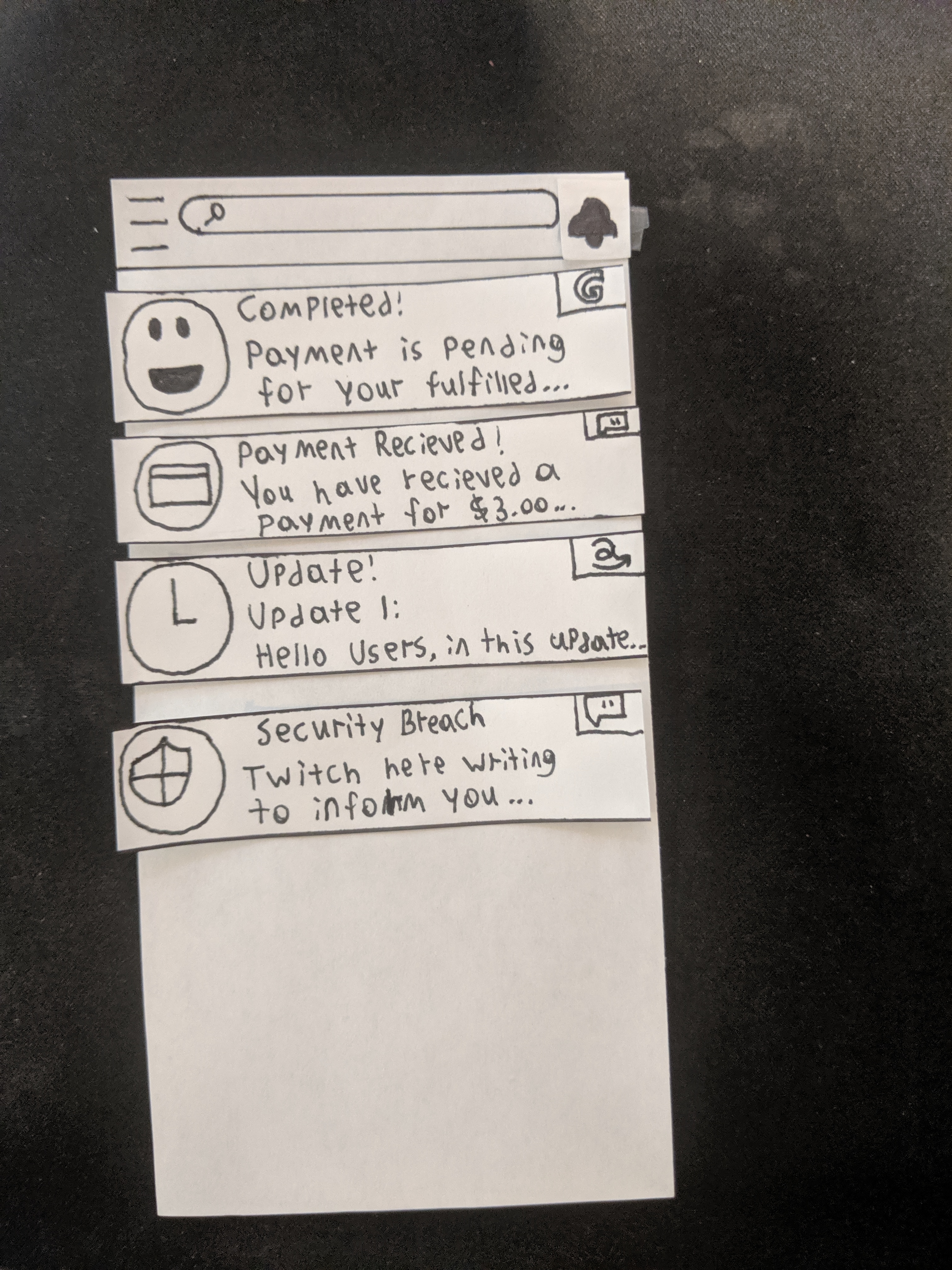
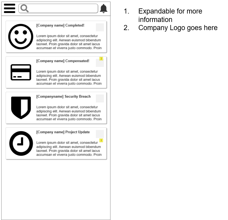
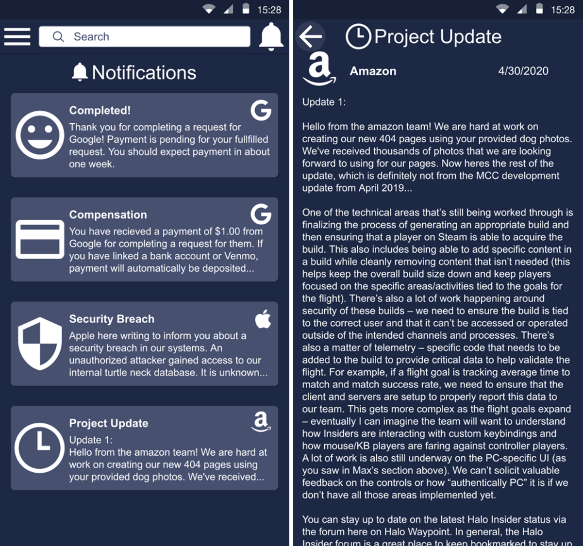
Notifications
This screen is where all notifications for a user are located. This is also another goal of our app, which is to give users updates on how thier data is being used. The four different notification types are displayed below and when one is opened it will go to a new screen with the full information from the notification.
Desktop Mock-up
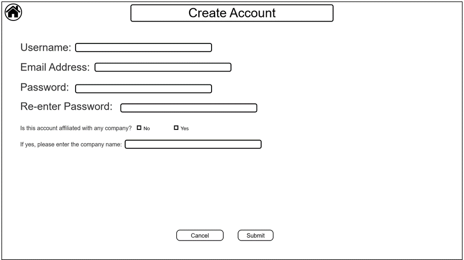
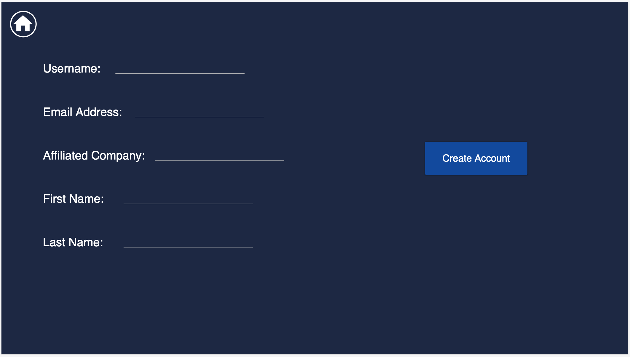
Landing Page and Create Account
This is the landing page for the webiste, where the user can login if they have an account, or go to the account creation screen to create an account for themselves.
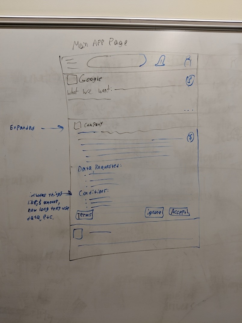
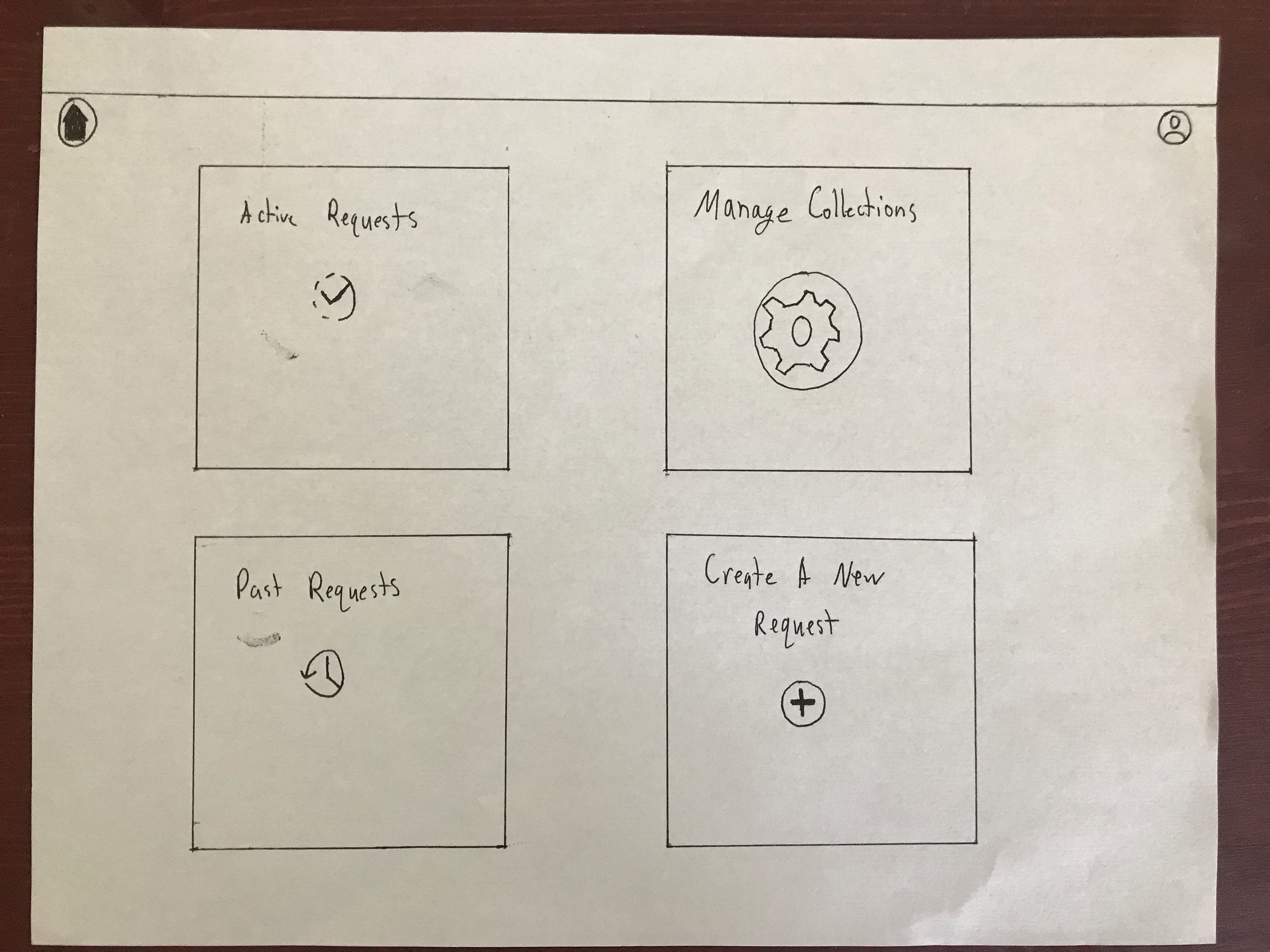
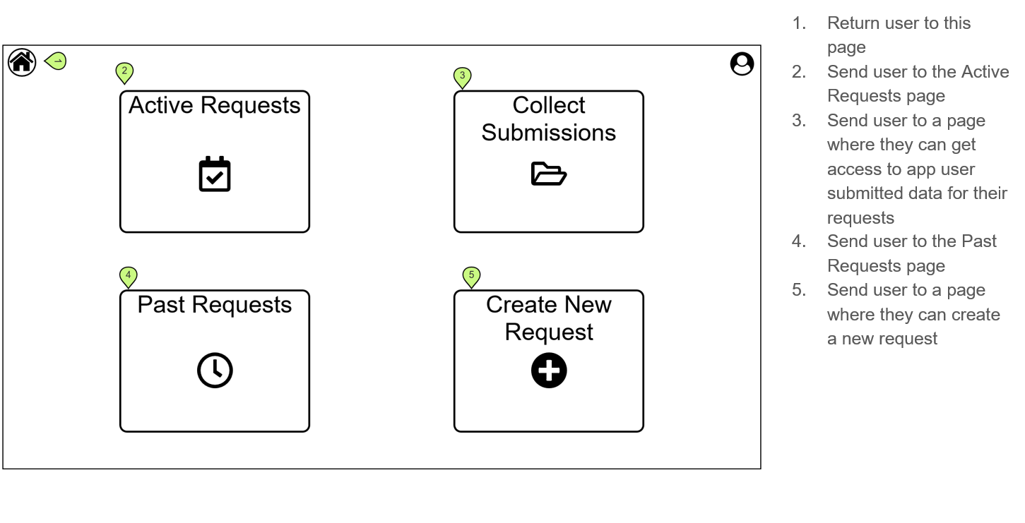
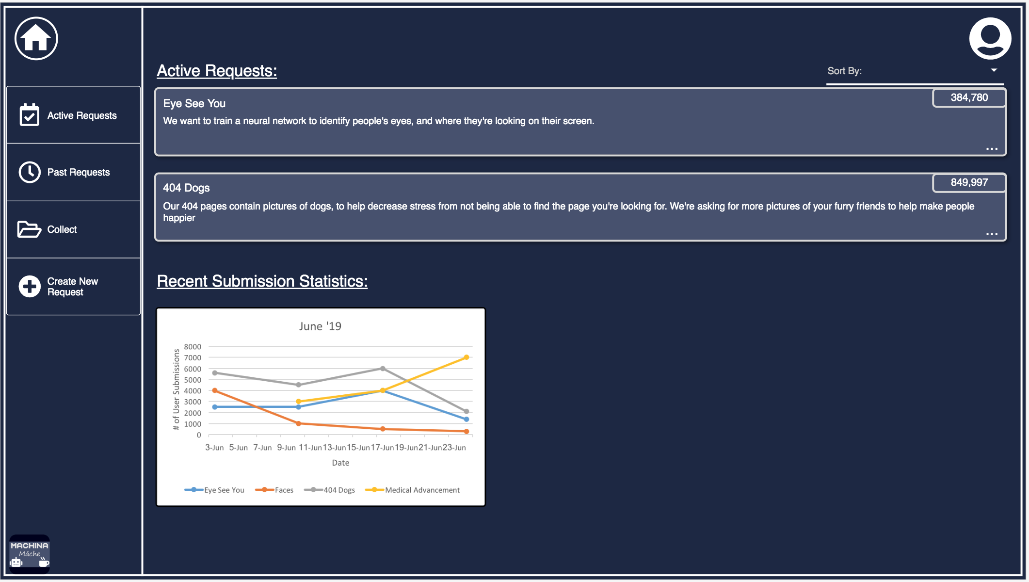
Home Page
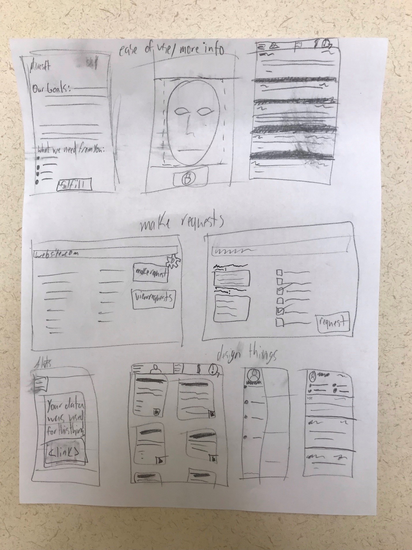
This screen is the central home page of the website. It contains navigation tabs on the left to get to various screens, and icons to take the user to the account page and back to this home page. All these navigational buttons are consistent across all screens, except where changing to a screen would not make sense. The Home page contains a small selection of the user’s active requests, with a dropdown menu to change how they are ordered. In addition, it contains some simple statistics about the performance of certain requests over the last month
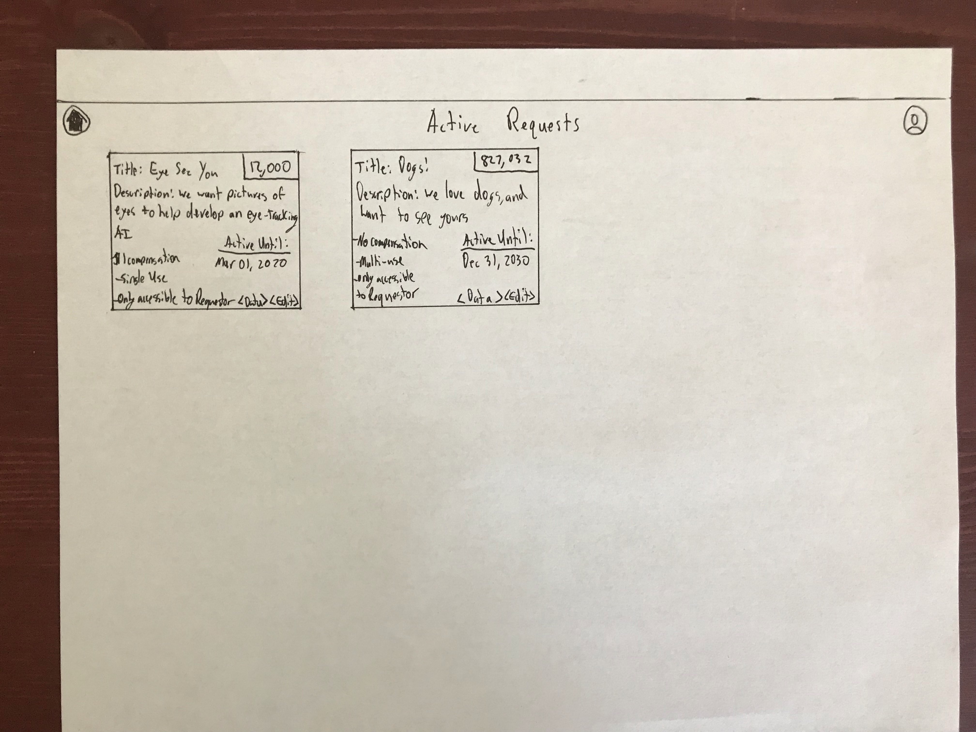
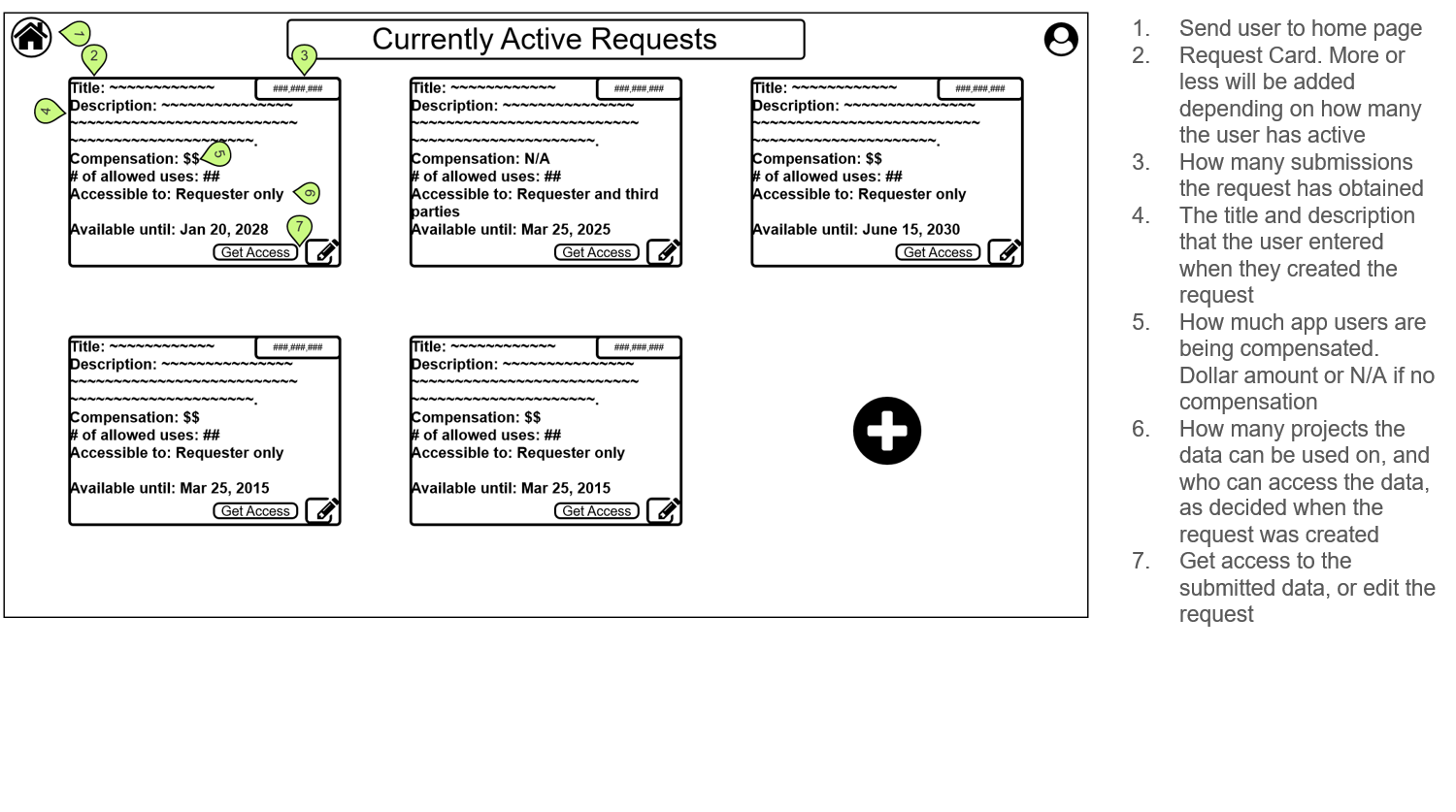
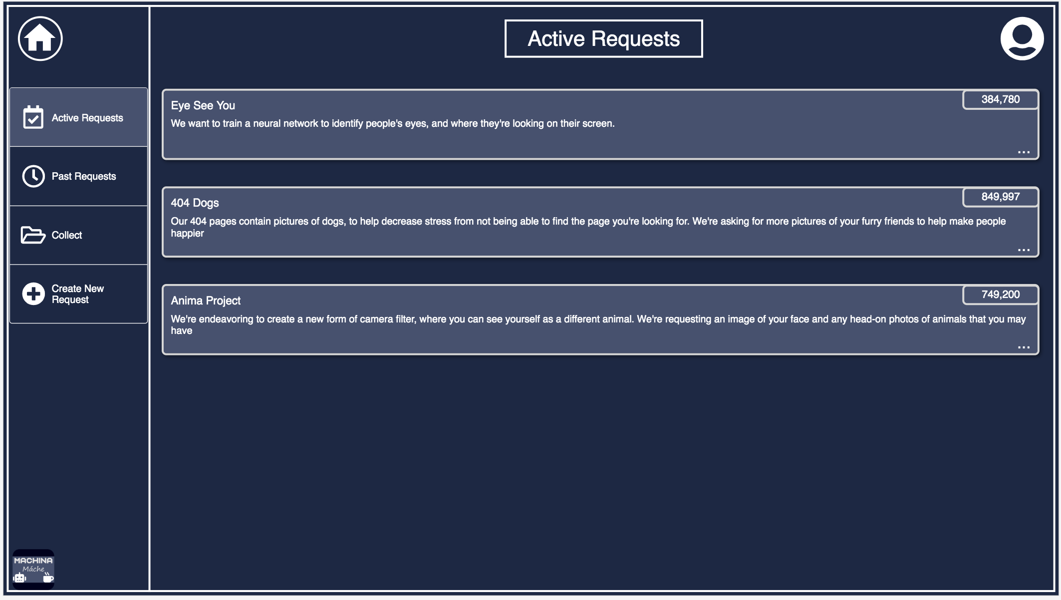
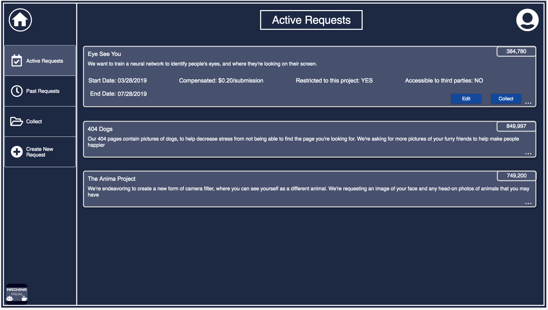
Active Requests
This page contains the user created requests that are still active, in that they will be shown to app users. Clicking on the expansion dots on the lower right of each box will expand out to show more detailed data, and allow the user to edit certain parameters of the request or collect submissions from app users. This page, and all the others of similar formats, were significantly redesigned after the wireframing phase. The feedback we received caused us to rethink how the information was presented, and the general design of the request cards
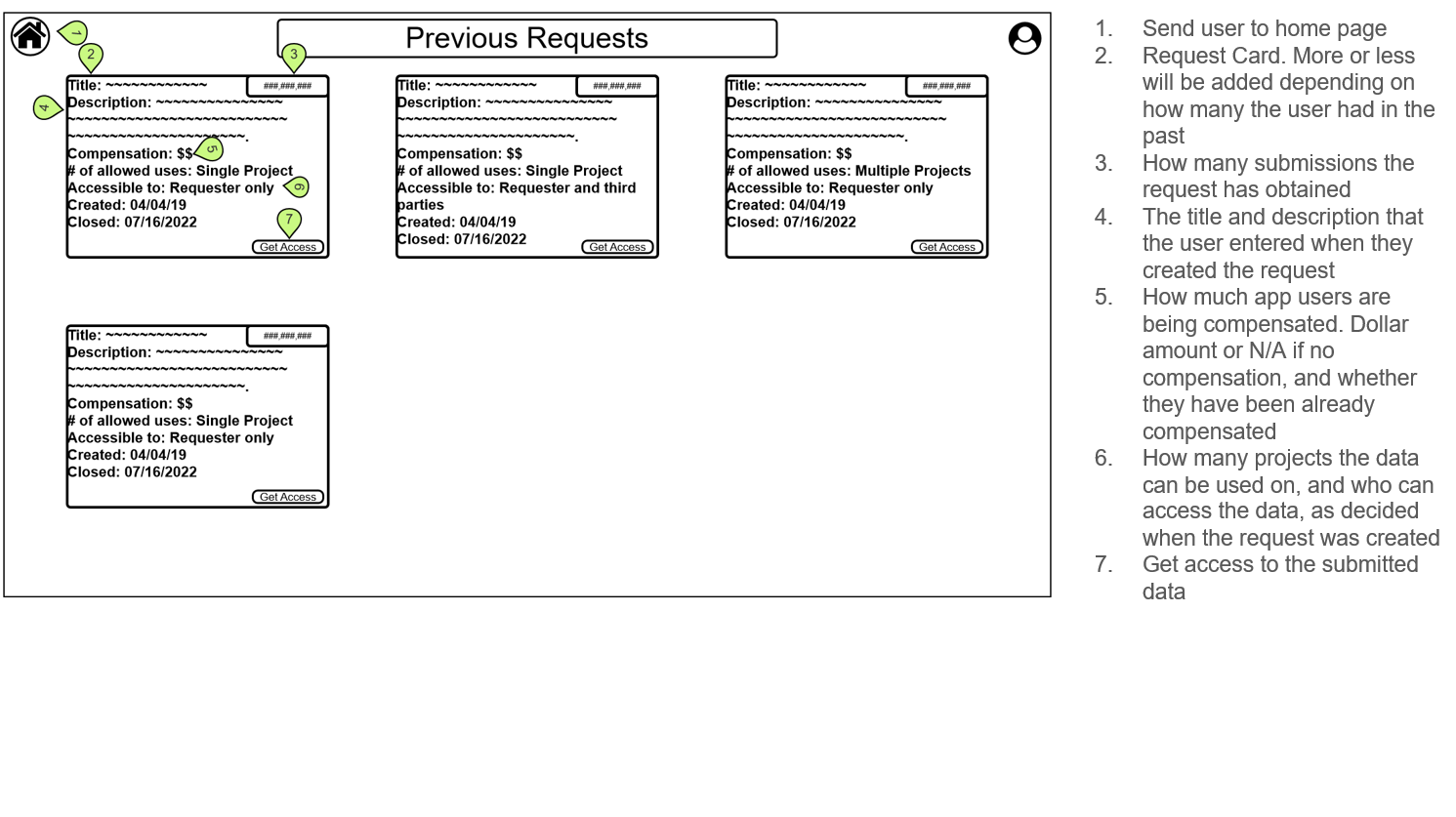
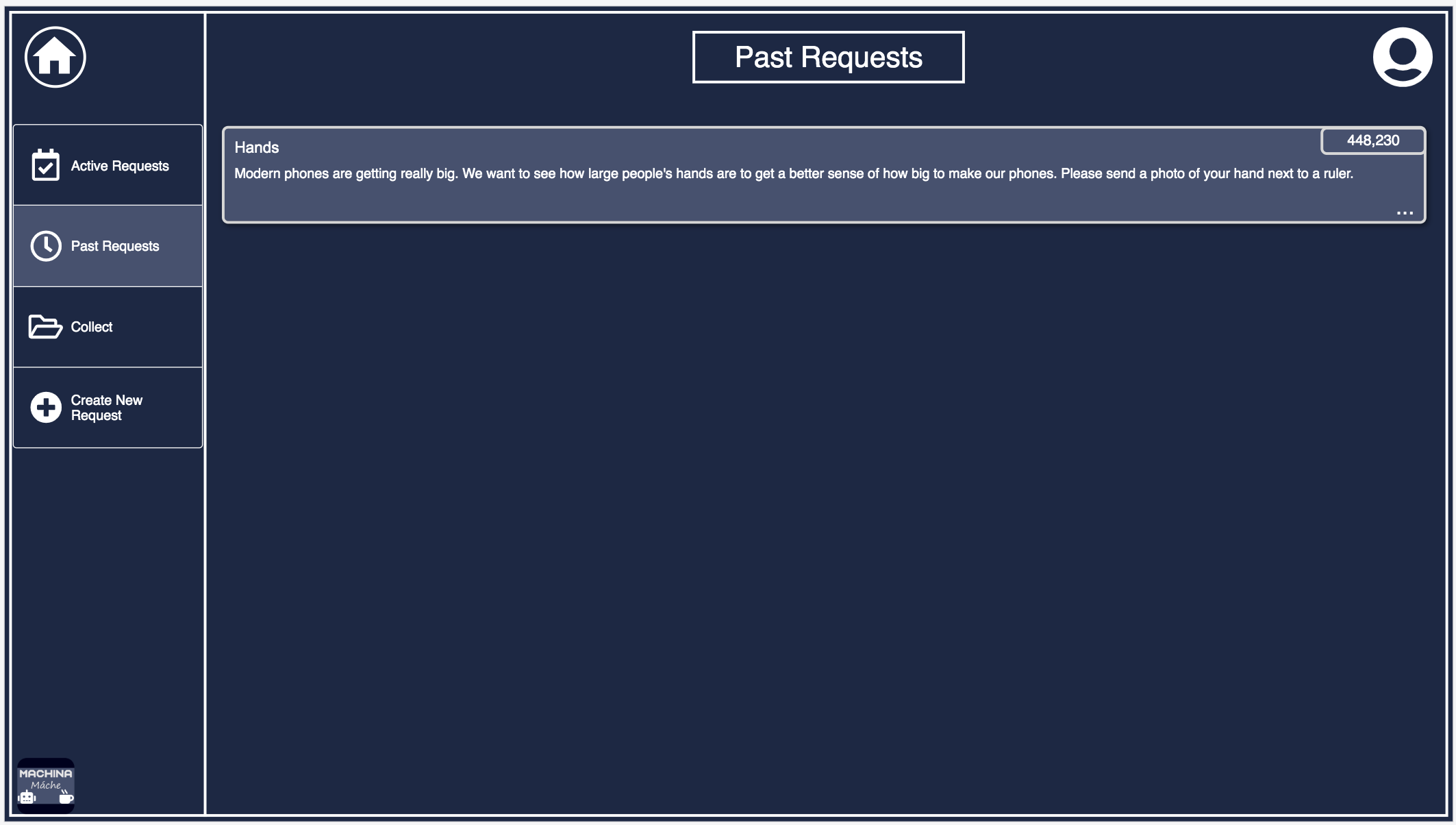
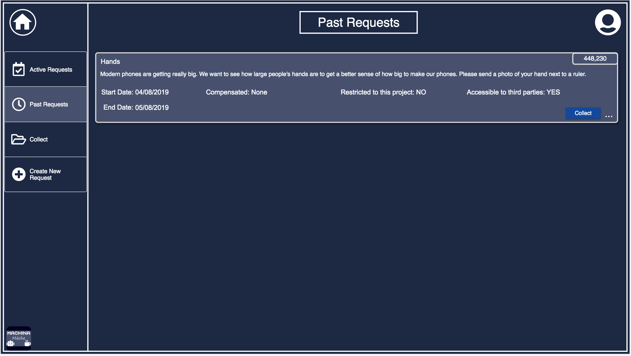
Past Requests
This page contains the user created requests that have passed their end date. The functionality of this page is identical to the active requests page, excepting that requests cannot be edited.
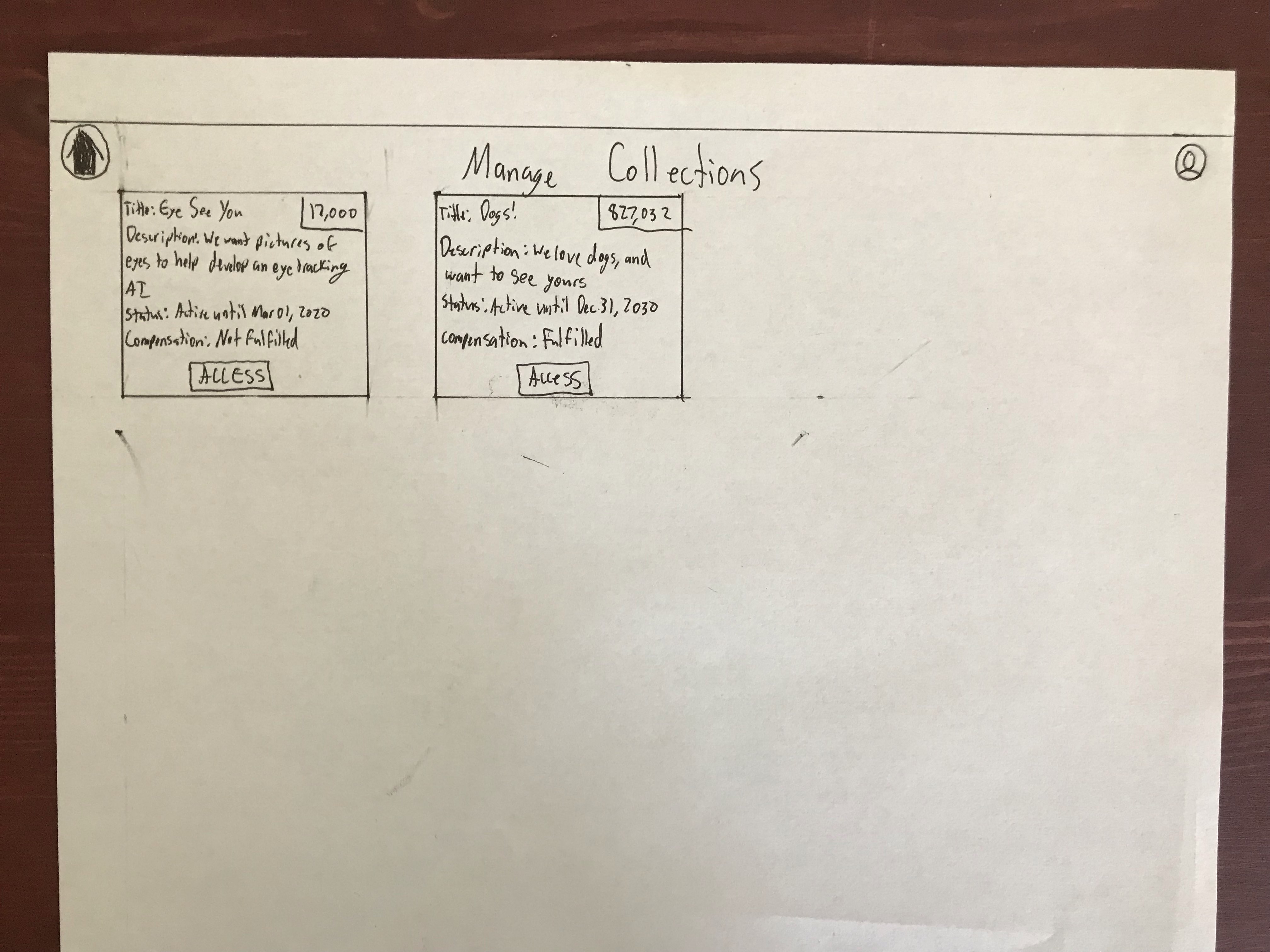
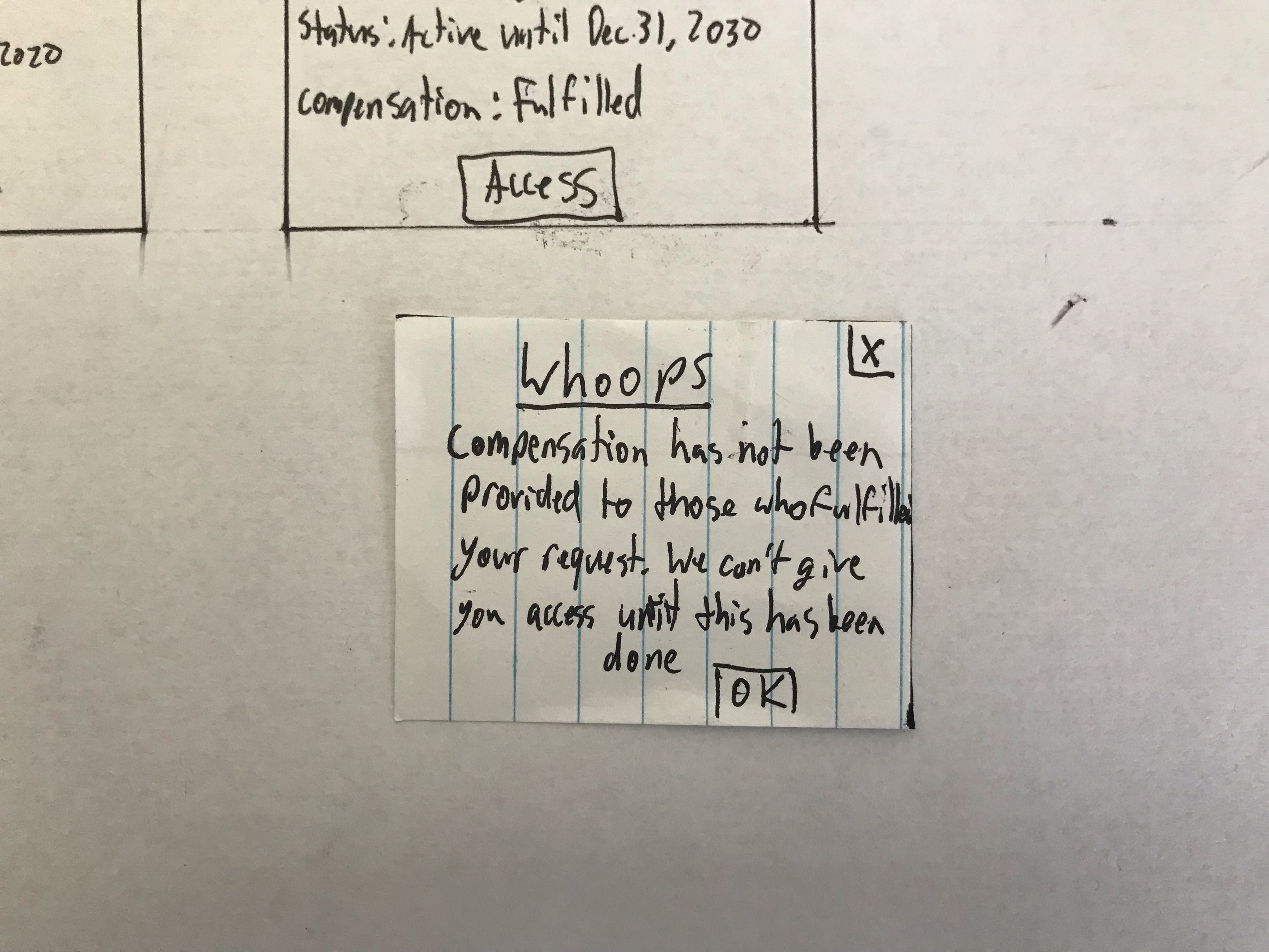
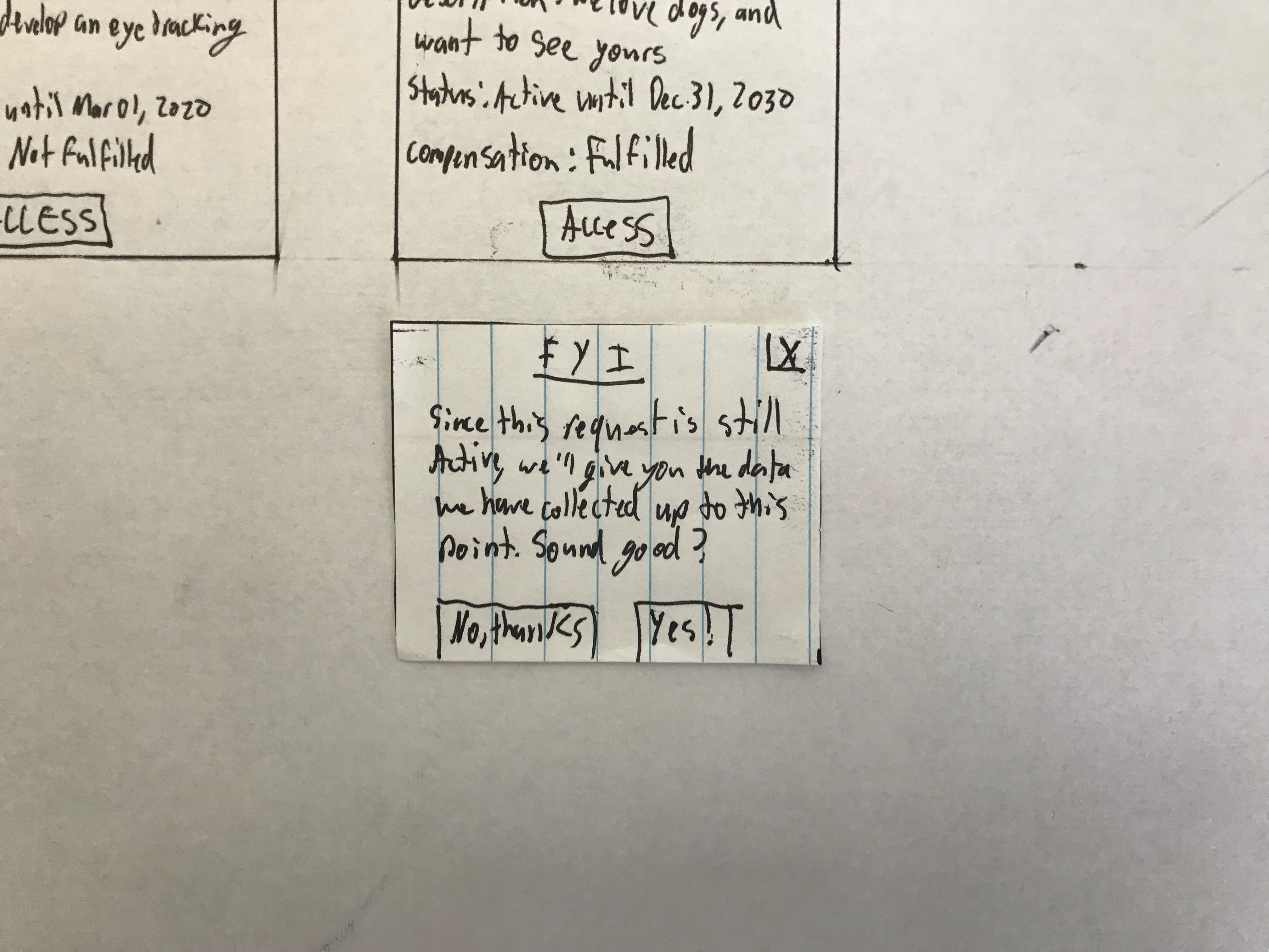
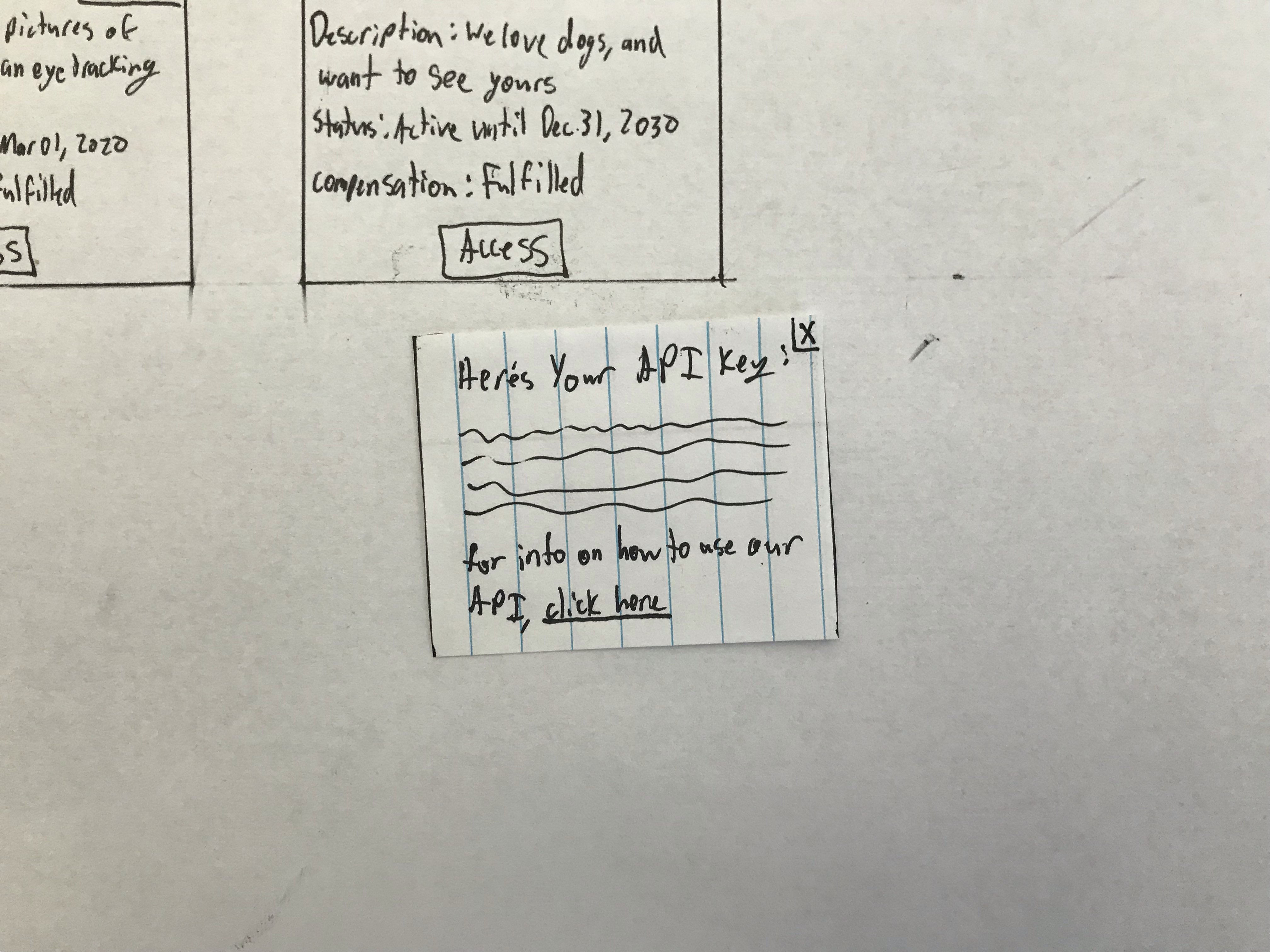
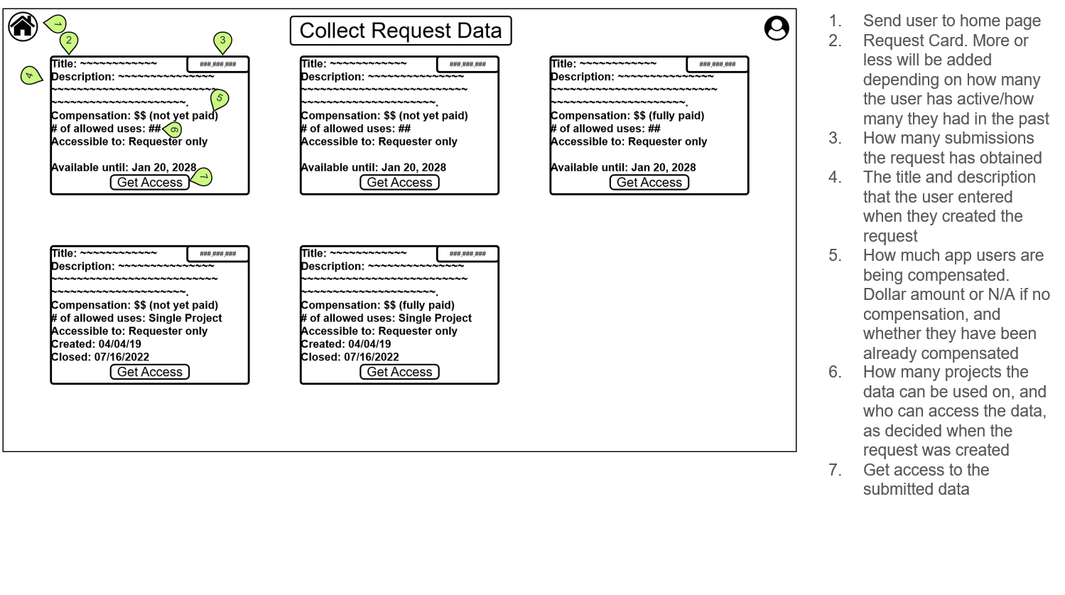
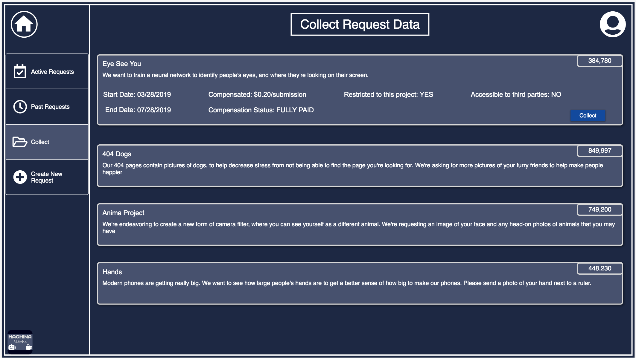
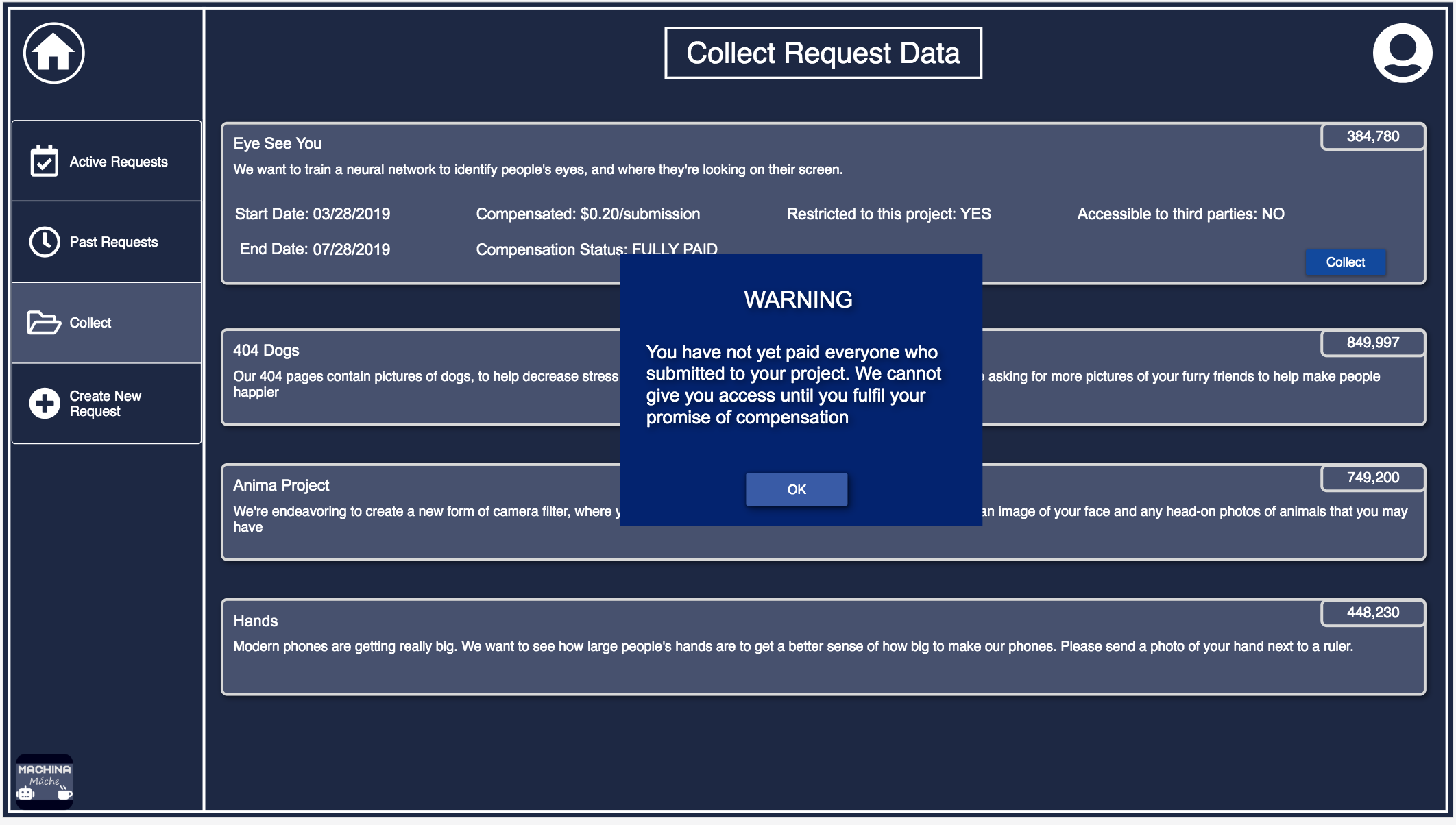
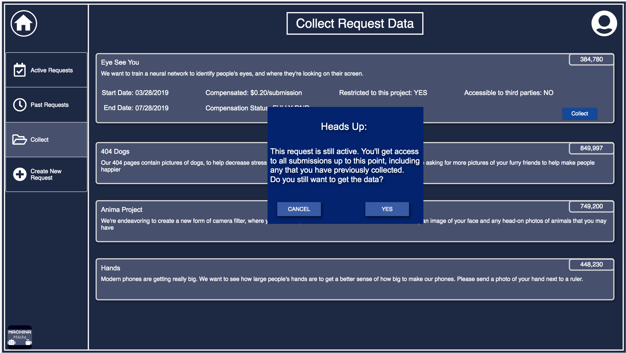
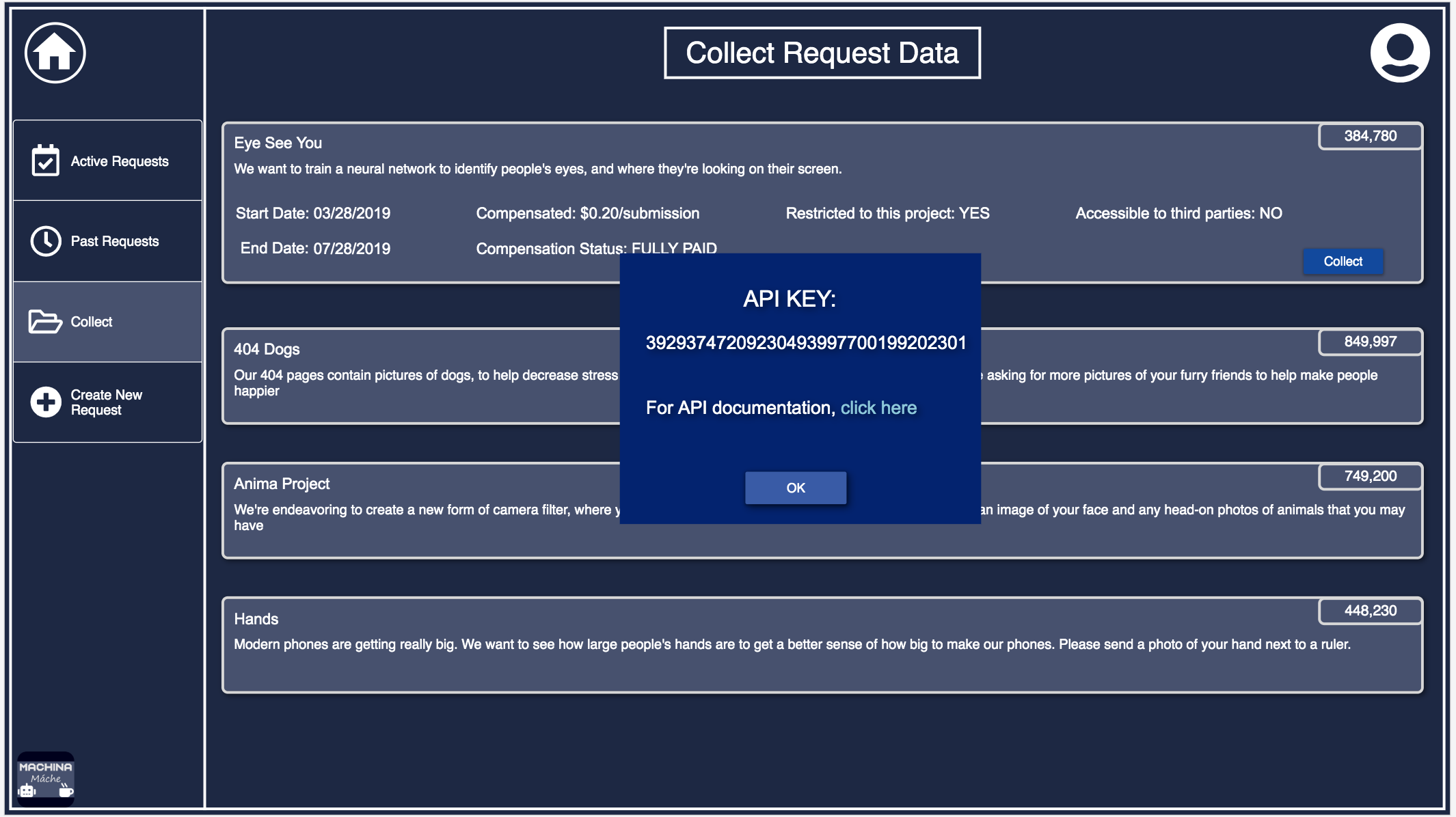
Collection Page
This page is where the user can collect the data that app users have submitted to their requests. The data is given through an API key which will not be presented if the promised compensation has not been provided to the submitters.
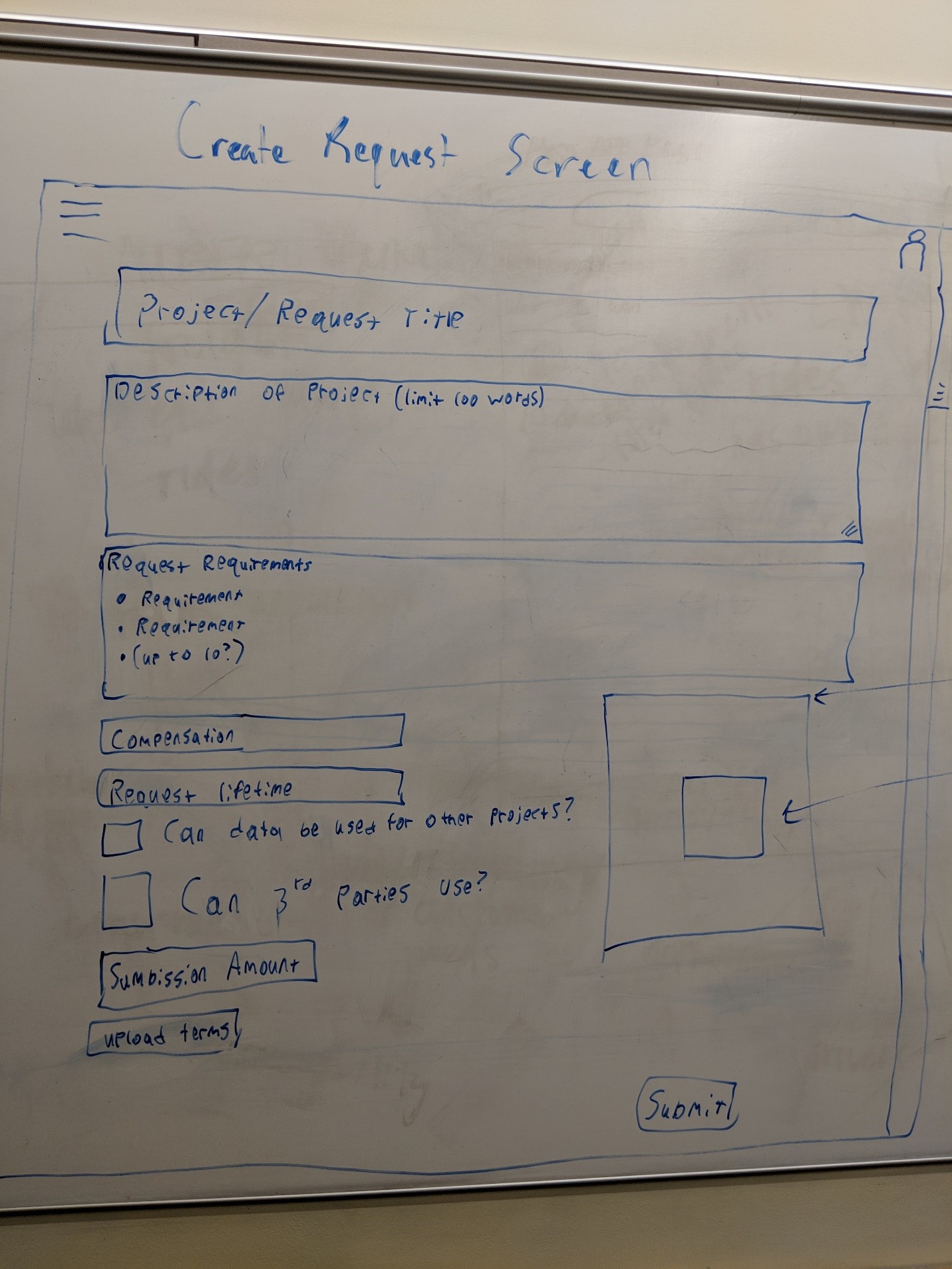
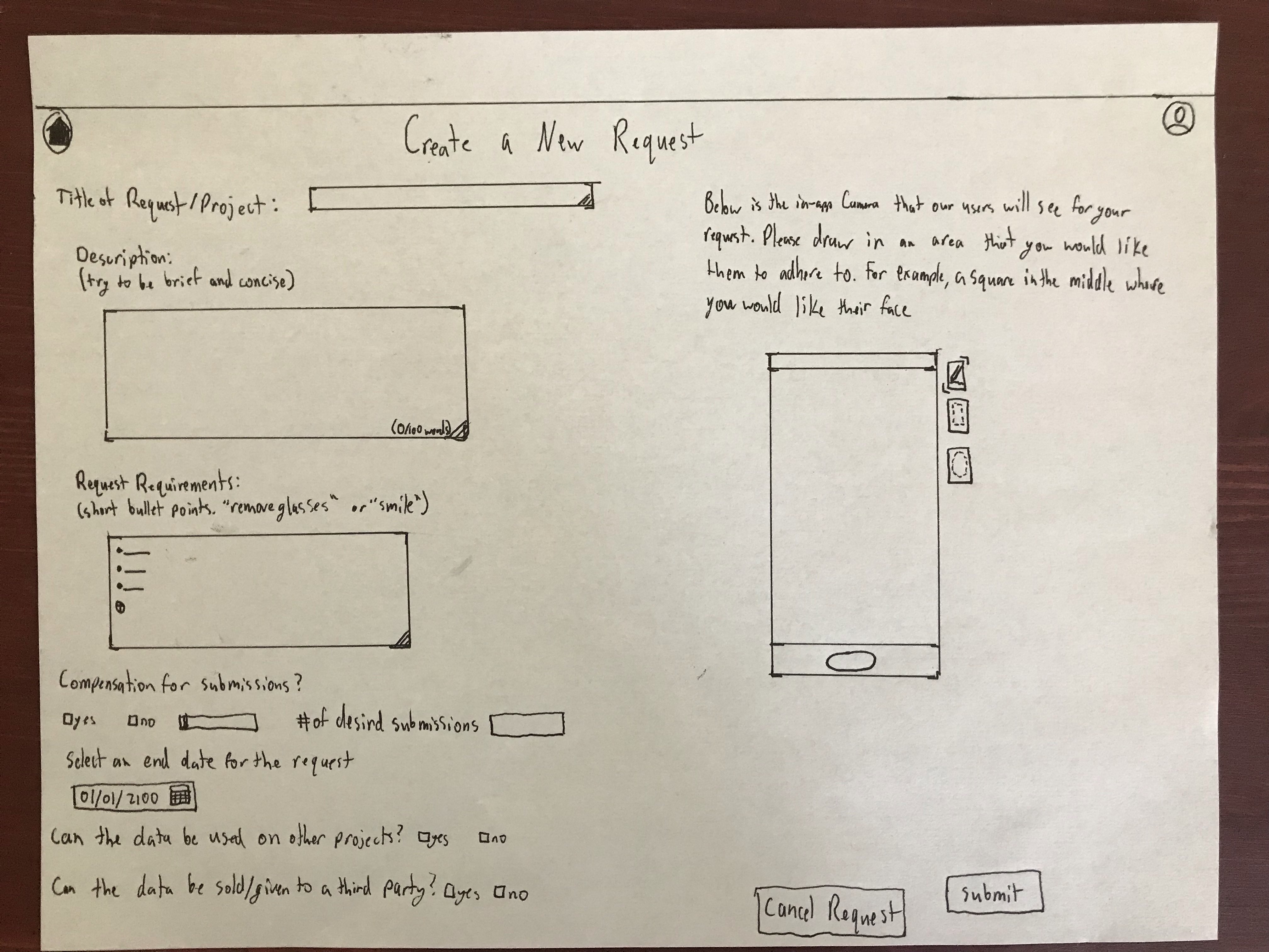
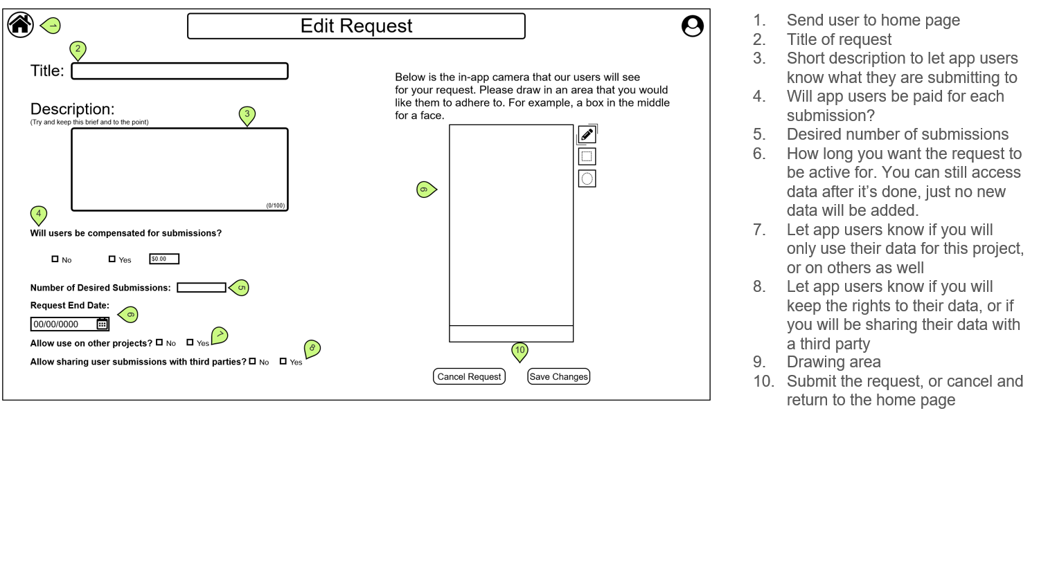
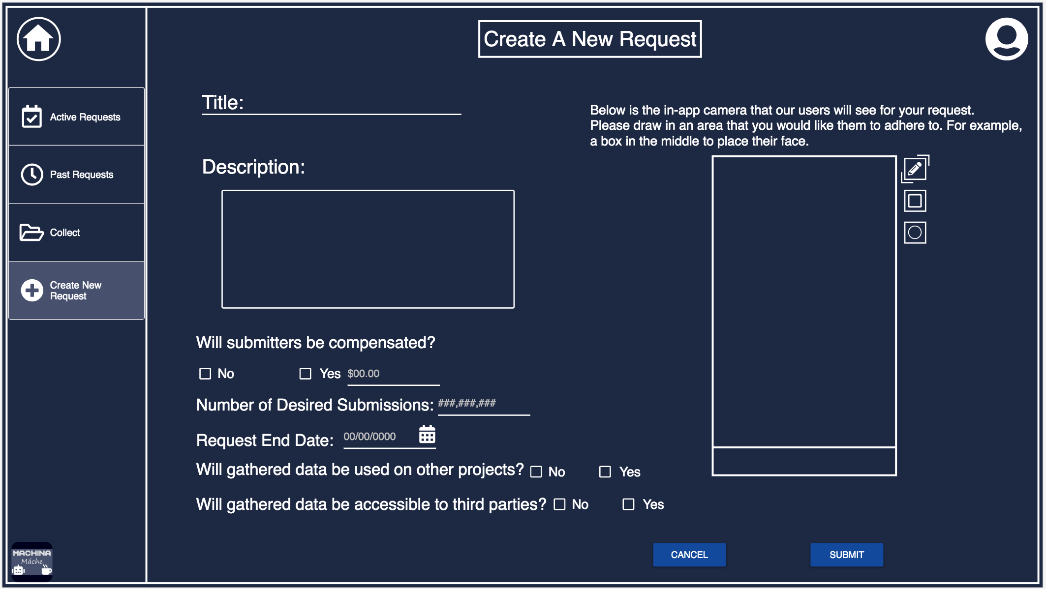
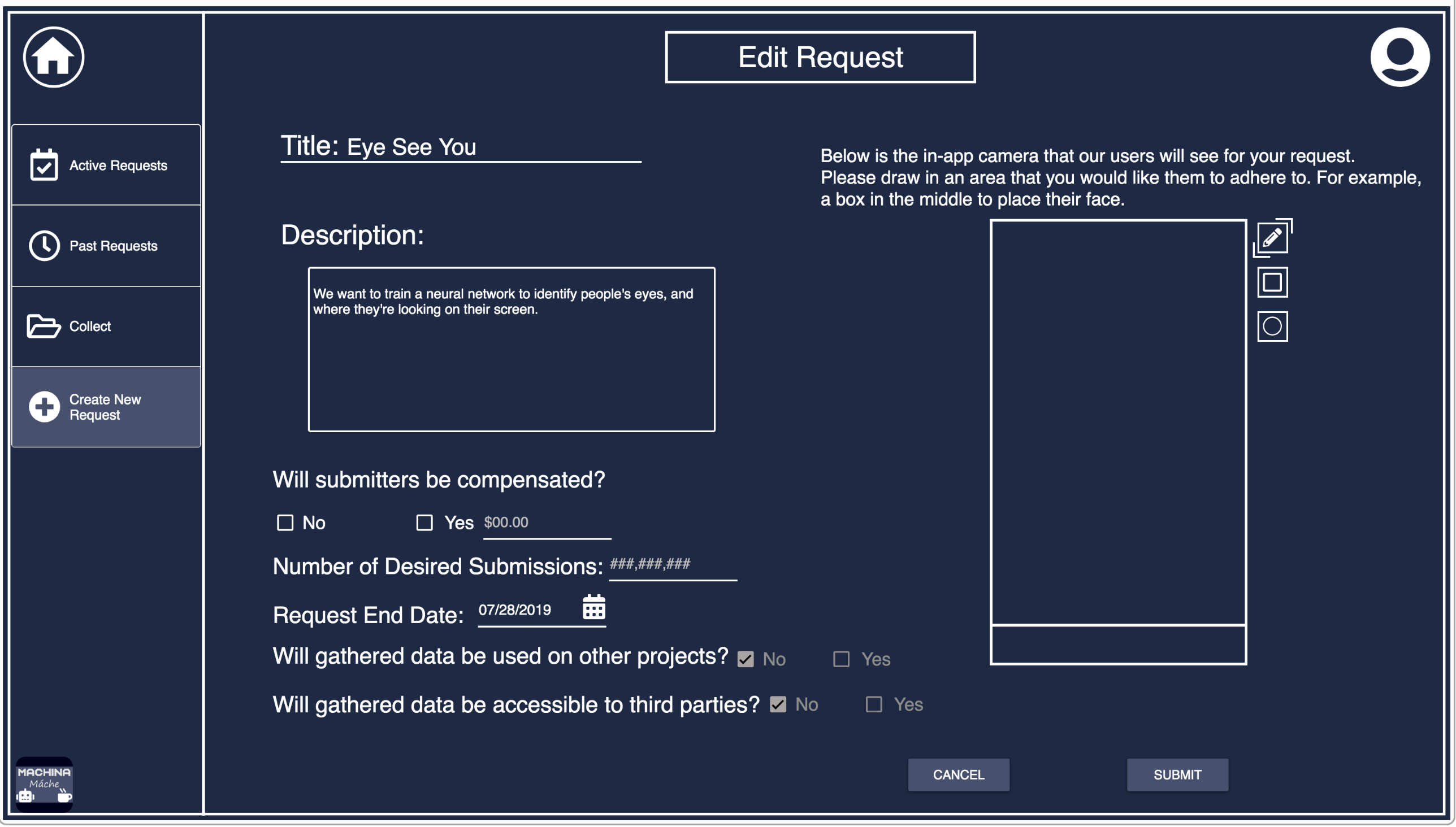
Create/Edit Request
This page is where the user can create a new request to be presented to app users to fulfill. They can also edit currently active requests, but are not allowed to change the accessibility of the app users data to other projects or third parties, as that could violate the trust that the submitters had in the requester.The design of the text boxes was changed after the wireframing stage in order to make the design more consistent across the website and the mobile app.
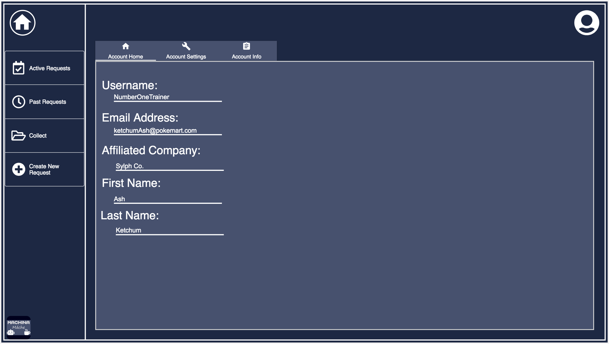
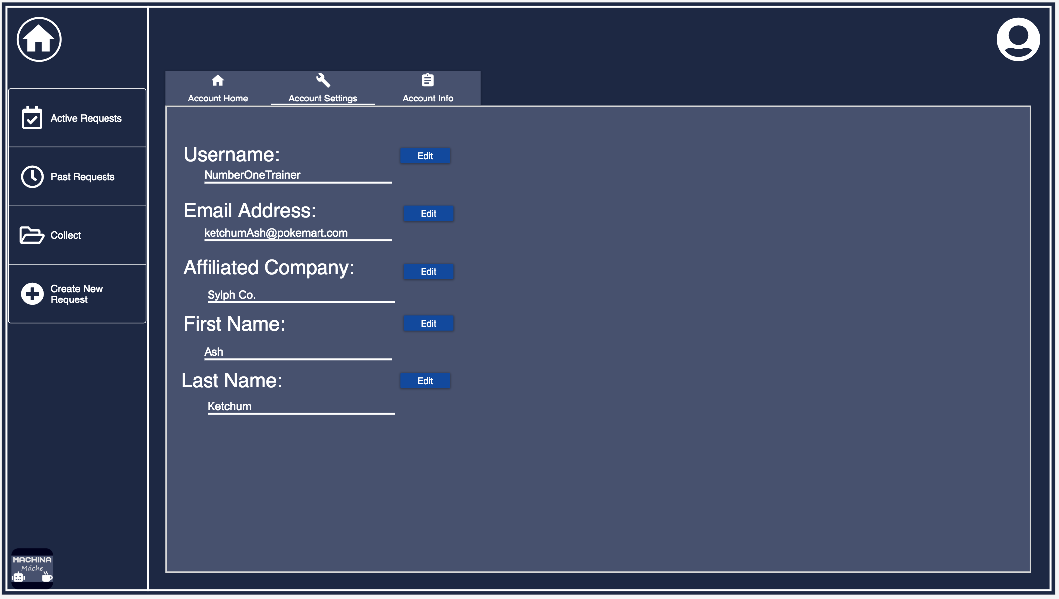
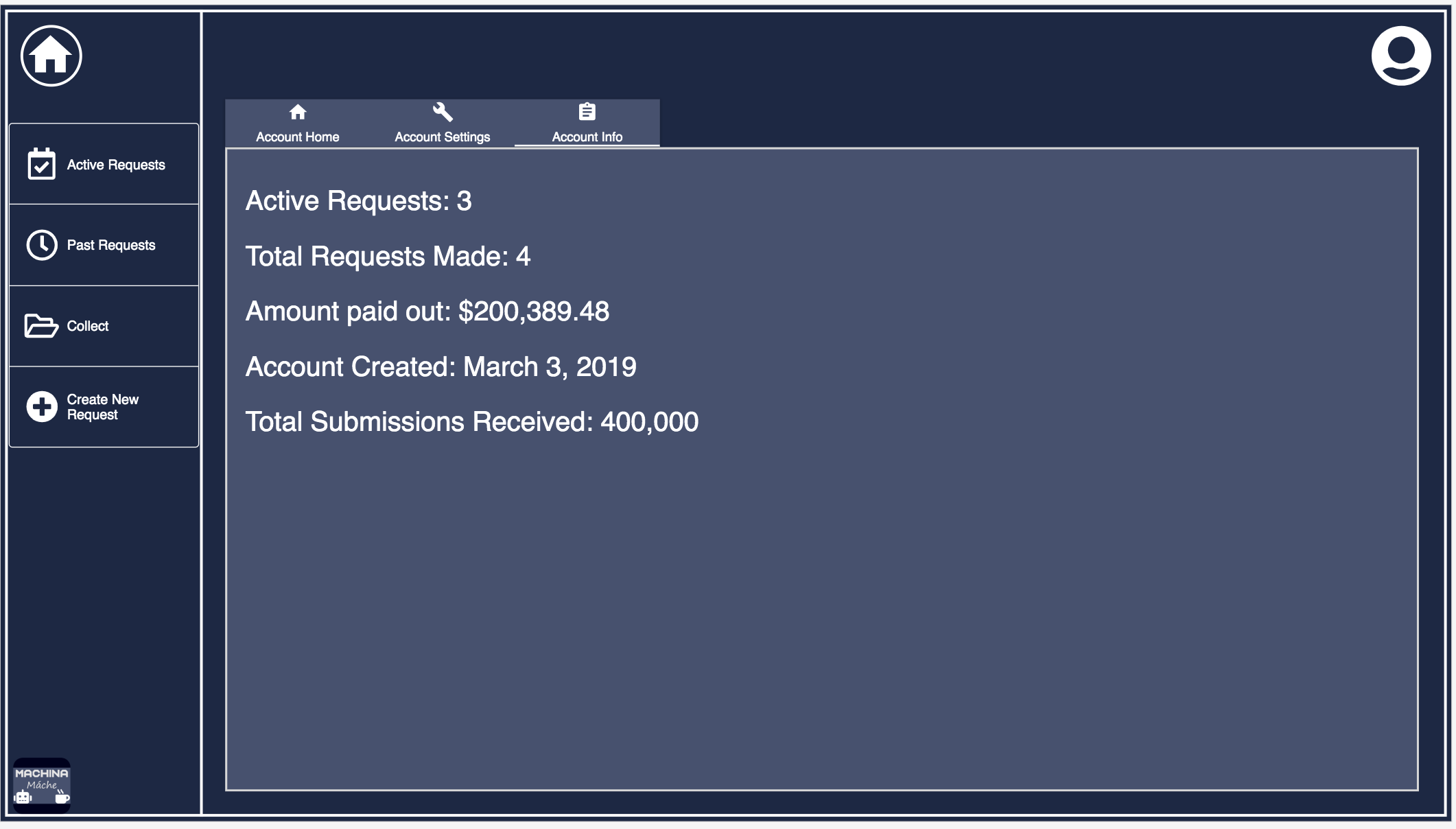
User Account
This page is where the user can view information about their account, change that information, and view some statistics on the activity of their account.